Images
Images play a crucial role on websites by enhancing user experience, conveying information quickly, and supporting branding efforts. Here are the primary reasons why images are used on websites:
- Visual Appeal: Images make websites more visually appealing and engaging, helping to capture and hold users' attention.
- Communication: They can convey complex information quickly and efficiently, sometimes more effectively than text alone. Infographics, charts, and diagrams are good examples.
- Emotional Connection: Images can evoke emotions and create a connection with the audience, enhancing the overall user experience.
- Branding: High-quality, relevant images help reinforce a brand’s identity and message.
- SEO: Properly optimized images can improve a site's search engine rankings and drive more traffic.
- Usability: Images can aid navigation (e.g., icons) and improve the overall usability of a website.
- Accessibility: Visual content can make a website more accessible to users with certain disabilities when used alongside appropriate alt text.
In Sitefinity
Sitefinity makes it easy to manage and use images effectively on your website, enhancing both the user experience and site performance. Below learn about best practices and all available image options within Sitefinity.
The Basics
Best Practices
By following these best practices, you can effectively leverage images to enhance the functionality, aesthetics, and user experience of your website:
- Relevance & Contextual Placement: Use images that are relevant and placed contextually within the content to enhance readability and ensure they complement the purpose of the page. They should support the text and not distract from it.
- Quality & Consistency: Ensure that images maintain a consistent style, are high-quality and professionally done, and create a cohesive visual experience across the website.
- Optimization: Optimize images for web use to ensure fast loading times. This includes using the right file formats (e.g., JPEG for photos, PNG for graphics with transparency) and compressing files without sacrificing too much quality. Learn How to Crop and Resize Images.
- Responsive Design: Test the responsiveness of images to ensure they work at or adjust to different screen sizes and resolutions.
- Alt Text: Provide descriptive alt text for all images to improve accessibility and help search engines understand the content of the images.
- Text & Contrast: Avoid using text over an image when the text is saved to the image file, instead use CSS to overlay live/html text over the image, ensuring the contrast ratio for the colors in the image and the color of the text meet AAA Accessibility compliance.
- File Naming: Use descriptive file names that include relevant keywords. This can aid in SEO and make files easier to manage.
- Licensing: Ensure you have the right to use any images on your site, whether through ownership, licensing, or public domain sources. Do not take images from other sites or google searches. Avoid copyright infringement. Learn more about UTMB’s Image Library, Razuna.
How to Optimize Images
-
Optimize images for the web
Image File Type Options
There are three primary file types used in Sitefinity we’ll want to focus on for saving images, optimized for the web: GIF, JPG and PNG. Each file type has its own strengths and weaknesses and it is very important to know and keep these in mind when saving an image. Here are a few details:
- GIFs are not for high-quality images, but you can use animated GIFs
- JPGs can be optimized to a very small file size while keeping the high quality of an image
- PNGs are typically used when a transparent background is needed
Saving Images Properly
Large images on a web page take longer to load. By “large”, we are referring to file size rather than the dimensions of an image, i.e. the value in KB, MB, GB etc. Users expect a webpage to load in under 2 seconds, and most will abandon a page that takes more than 3 seconds to load. It’s important that your images are small enough to ensure a speedy site. There are three things you can do to properly optimize your images for your web site:
- Make the image the proper proportions and dimensions
You will need to determine what is the largest size your image will be in all responsive views (i.e. phone, tablet or desktop). - Save the image “for the web”
It is possible to reduce the size without reducing the quality of the image on a screen. This requires changing the image resolution down to 72 PPI without losing the proper final dimensions or proportions and then compressing the image. - Compress the image
You can do this with Photoshop or other online tools like www.tinyjpg.com, www.tinypng.com or https://pixlr.com/e/. The goal is to get large “hero” images under 100KB, and images smaller than 800px wide under 50KB. The smaller the file size, the less data people have to load on the browser. - Recommended image dimensions
- Fullscreen banner: 1900 px wide by 550 px high
- Featured image of a blog or news post: 900 px wide by 400 px high
- Image floated left or right within a content block: 400 px wide
Images of Text
Genuine text is much more flexible than images: It can be resized without losing clarity, and background and text colors can be modified to suit the reading preferences of users. Images are more likely to distort and pixelate when resized. In those rare situations where images of text must be used, the text alternative must contain the same text presented in the image.
If you would like to have text float over a banner, please review how to create a blog slider.
-
Editing images in Photoshop for the web
In the example below, the image is 3.4MB in file size (that's huge!) and the dimensions are 5760px by 3840px.
Cropping the image to the correct proportions:
- When you open the image in Photoshop, on the left you will see the tools available to you.
- Select the crop tool (green square shown in the image below). Your image will then show crop marks on the edges of the view finder, and you can set the crop ratio (or proportions) on the top bar (red oval shown in the image below). For this example, the ratio was set to 1100x450 because that is the final desired size of the image.
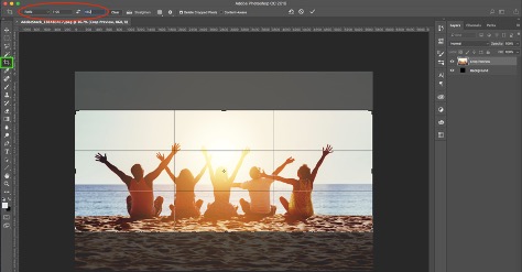
- You can then move the crop area around and select any area in the image.
- Hit enter, and the image is cropped.
Save the image:
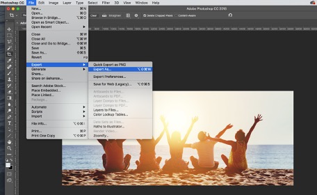
- Next, click ‘File > Export > Export As…’
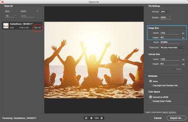
- Now, you can optimize the web image by changing its dimensions (image size: blue box shown in the image below). In the example below the dimensions were changed from width 5760px and height 3840px to width 1100px and the height automatically adjusted to 450px. However, the file size is still a little large at 363KB.
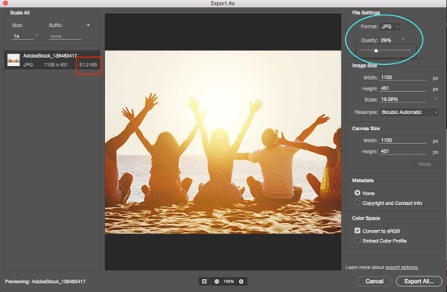
- Bringing down the “Quality” of the image will help with this. On the right side of the window, you will see the “Quality” dropdown, click that and you will have the ability to alter the quality by sliding the little triangle to the left (blue oval). You will see the file size go down as the quality refreshes (red box). At 100% zoomed, make sure the image does not begin to look pixelated. In the example below, the image is reduced to 29% quality and 51.2KB without being too pixelated.
- Click ‘Export All’, use a name that is meaningful and save it.
-
Editing images in Pixlr for the web
Pixlr is a free online photo editing tool.
Use the Editor Option:
- Do not make an account or save the image to an account
- This site will allow you 3 free downloads per day, per browser (clearing your cache may allow for more).
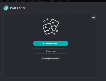
Open image:
- Click the Open Image button and select the image that is stored on your device
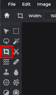
Crop the image:
- Click the crop tool in the left side toolbar
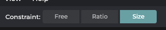
- In the upper toolbar menu, click the Size button.
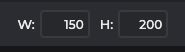
- Add the desired width in the W field and height in the H field.
- Adjust the crop box on the image to the desired crop by dragging the corners.
- Then click Apply or hit Enter on your keyboard.

Save the image:
- Next, click File (top-left hand corner) and then Save from the drop-down menu
- Change the Quality of the image to the lowest setting without causing pixelation or losing definition by sliding the circle on the bar to the left. As this change is made, you will see the “size” number below the image change (12kb in the example below). It is also okay to increase the quality if the file size is small.
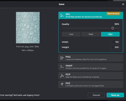
- Click Save as and save it to your device. (Click the X on the pop-up.)
Sitefinity Modules
Image Libraries
The Images page lets you create and maintain libraries for the images that you upload. There, you see the number of images in each library, the date of the last uploaded image, and where those images are stored.
-
Upload images to a library
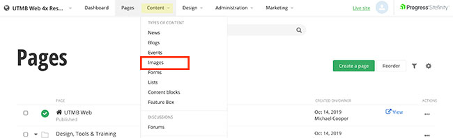
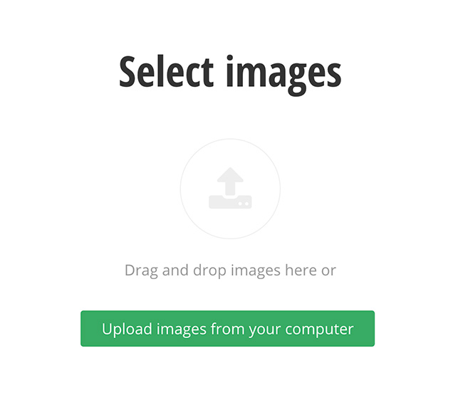
- Click the Content navigation menu item and then select Images
- Click the Upload images button
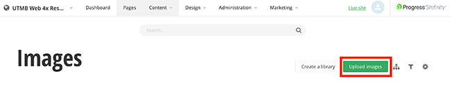
- Drag and drop images or click the Upload images from your computer button to select images.
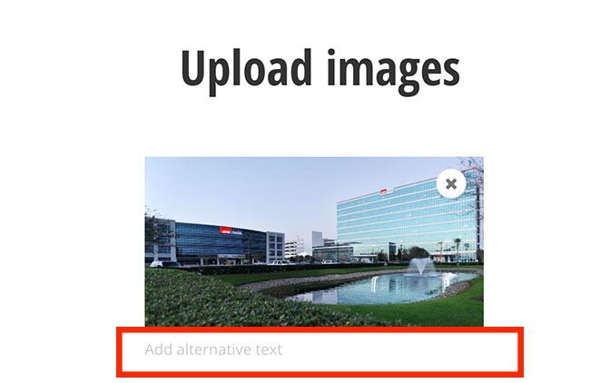
- Add alternative text. Alt text (alternative text) is a word or phrase that can be inserted as an attribute in an HTML (Hypertext Markup Language) document to tell website viewers the nature or contents of an image.
- Select the pencil icon to either select an existing gallery or create a new one.
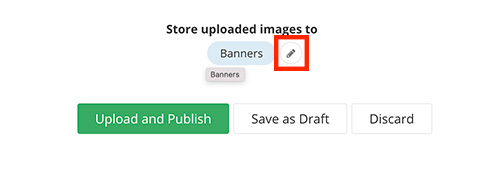
- Click the Upload and Publish button when finished.
- Click the Content navigation menu item and then select Images
Image in a Content Block
Images can be added to content blocks to allow for text wrapping or to take up the desired width by using columns, the image's natural width or changing the width="000" property in the HTML.
Sample Content Block
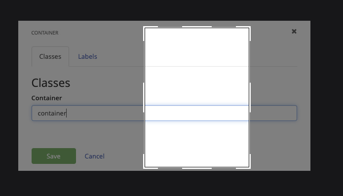
CSS Classes (set on image):photo-left
 Lorem ipsum dolor sit amet, consectetuer adipiscing elit. Duis ligula lorem, consequat eget, tristique nec, auctor quis, purus. Vivamus ut sem. Fusce aliquam nunc vitae purus. Aenean viverra malesuada libero. Fusce ac quam. Donec neque.
Image Widget
-
Add Image widget to a page
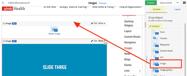
Within the edit view of a page, you can add the image widget to a page.
- On the right side menu, click the Content tab, click the Content drop-down menu and find the Image widget. Click, hold and drag the Image widget onto the desired part of the
page, and then release the image widget
- On the right side menu, click the Content tab, click the Content drop-down menu and find the Image widget. Click, hold and drag the Image widget onto the desired part of the
page, and then release the image widget
-
Add an image using the Image widget
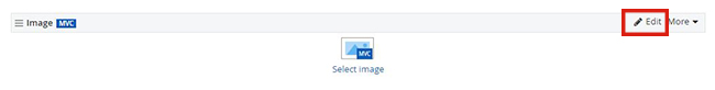
- After you have added the image widget to a page, click the Edit button on the widget
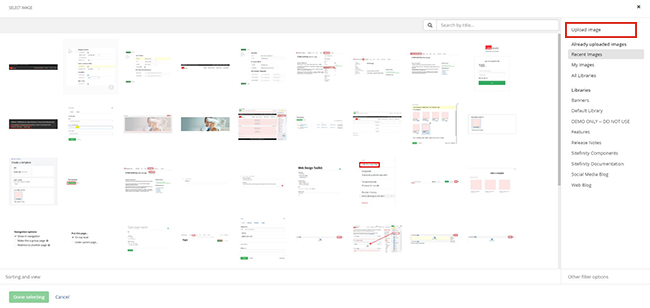
- You can either upload an image from your computer or select a preloaded image. Review how to upload images to a gallery.
- Upload an image from your computer
- Click the Upload image link in the upper-right-hand corner of the screen
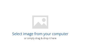
- Click the Select image from your computer link to select a photo or simply drag and drop an image.
- Select where to store the uploaded image, add a meaningful title and alternative text and click the Upload button
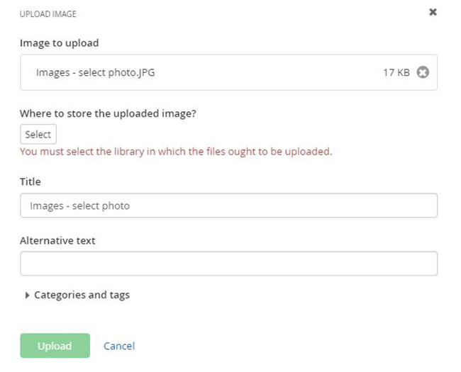
- You can adjust the title and alternative text if needed. Do not adjust the image size on this screen. All cropping and image optimization should be done before it is uploaded to Sitefinity. Click the Save button when complete.
- Click the Upload image link in the upper-right-hand corner of the screen
- Upload an image from your computer
- After you have added the image widget to a page, click the Edit button on the widget
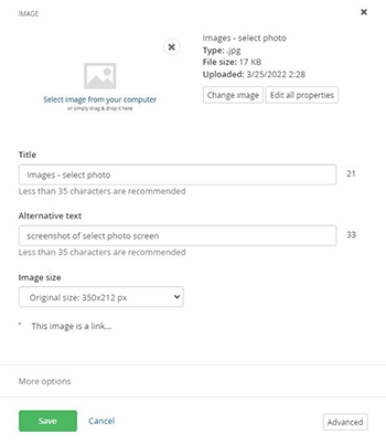
Image: Full Size (w/ Hyperlink)
Hyperlink to full-size image added using the image widget editor.
Image Gallery
Image Galleries within Sitefinity allow users to display images in a variety of gallery formats.
Customizations
Image Photo Classes
These photo class options can be directly applied to images within the HTML content when images are inserted into Sitefinity Content Blocks or in any Module using the WYSIWYG editor, they may also work when applied to the More Options area on the widgets.
Border & Spacing
CSS Classes (set on image):photo
Lorem ipsum dolor sit amet, consectetuer adipiscing elit. Duis ligula lorem, consequat eget, tristique nec, auctor quis, purus. Vivamus ut sem. Fusce aliquam nunc vitae purus. Aenean viverra malesuada libero. Fusce ac quam. Donec neque.
Border & Spacing w/Caption
CSS Classes (set on image):photo-caption
Lorem ipsum dolor sit amet, consectetuer adipiscing elit. Duis ligula lorem, consequat eget, tristique nec, auctor quis, purus. Vivamus ut sem. Fusce aliquam nunc vitae purus. Aenean viverra malesuada libero. Fusce ac quam. Donec neque.
Border & Spacing w/Left Align
CSS Classes (set on image):photo-left
Lorem ipsum dolor sit amet, consectetuer adipiscing elit. Duis ligula lorem, consequat eget, tristique nec, auctor quis, purus. Vivamus ut sem. Fusce aliquam nunc vitae purus. Aenean viverra malesuada libero. Fusce ac quam. Donec neque.
Border & Spacing w/Left Align & Caption
CSS Classes (set on image):photo-left-caption
Lorem ipsum dolor sit amet, consectetuer adipiscing elit. Duis ligula lorem, consequat eget, tristique nec, auctor quis, purus. Vivamus ut sem. Fusce aliquam nunc vitae purus. Aenean viverra malesuada libero. Fusce ac quam. Donec neque.
Border & Spacing w/Right Align
CSS Classes (set on image):photo-right
Lorem ipsum dolor sit amet, consectetuer adipiscing elit. Duis ligula lorem, consequat eget, tristique nec, auctor quis, purus. Vivamus ut sem. Fusce aliquam nunc vitae purus. Aenean viverra malesuada libero. Fusce ac quam. Donec neque.
Border & Spacing w/Right Align & Caption
CSS Classes (set on image):photo-right-caption
Lorem ipsum dolor sit amet, consectetuer adipiscing elit. Duis ligula lorem, consequat eget, tristique nec, auctor quis, purus. Vivamus ut sem. Fusce aliquam nunc vitae purus. Aenean viverra malesuada libero. Fusce ac quam. Donec neque.
Size & Shape Styles
CSS Classes (set on image): (1)img-thumbnail (2)img-rounded (3)img-circle (4)img-pill

