Blogs: Blog Post Slider
Before getting started learn the basics:
How to create & edit blogs How to add blog posts to a page See all available template options
Layout Views
The widget component template
Learn how to do it:
-
Add Blog widget to a page
Within the edit view of a page, you can add the blog post widget and display blog posts.
- On the right side menu, click the Content tab, click the Content drop down menu and find the Blog posts widget. Click, hold and drag the Blog post widget onto the desired part of the
page, and then release the blog post widget.
- On the right side menu, click the Content tab, click the Content drop down menu and find the Blog posts widget. Click, hold and drag the Blog post widget onto the desired part of the
page, and then release the blog post widget.
-
Select the blog post list template (layout)
Within the edit view of a page, you can customize how blog posts display.
- After you have added the blog post widget to a page, click the Edit button on the widget
- Under the List settings tab, select the list template. Learn more about the available templates.
- After you have added the blog post widget to a page, click the Edit button on the widget
Blog Post Slider
Customizations
Customize with CSS Classes.
Learn how to do it:
-
Customize Blog slider with CSS
Within the edit view of a blog post, CSS classes can be applied to affect the look of the individual slide, image, or content of a blog post.
Under the Custom fields section add classes to the Blog Slide Custom CSS field. Multiple CSS classes can be added but must be separated by a space. CSS classes can be found below.
Blog slide CSS classes
Classes with "sm" text will only affect small screens (smaller than 640px).
Classes with "md" text will only affect medium screens (641px to 1007px).
Classes with "lg" text will only affect large screens (1008px and larger).Card overlay color
- uk-overlay-default (White transparent background)
- uk-overlay-primary (Dark transparent background)
Card overlay placement
- uk-position-top
- uk-position-left
- uk-position-right
- uk-position-bottom
- uk-position-center
- uk-position-top-left
- uk-position-top-center
Slide Background Image Handling
- img-fill
- img-sm-fill
- img-md-fill
- img-lg-fill
- img-contain
- img-sm-contain
- img-md-contain
Content title text size, style and heading structure
- title-h1 (default)
- title-sm-h1
- title-md-h1
- title-lg-h1
- title-h2
- title-sm-h2
- title-md-h2
- title-lg-h2
- title-h3
- title-sm-h3
- title-md-h3
- title-lg-h3
- title-h4
Content summary text size
- summary-large
- summary-sm-large
- summary-md-large
- summary-lg-large
- summary-medium (default)
- summary-sm-medium
- summary-md-medium
Content text alignment
- text-left (default)
- text-right
- text-center
Content text color options
- content-red
- content-gray
- content-gray-light
- content-white (default)
- content-black
- content-blue
- content-blue-light
- content-teal
- content-teal-light
- content-orange
- content-orange-light
- content-green
- content-green-light
- content-gray-1
Card Overlay width (%-based)
- content-width-30
- content-width-sm-30
- content-width-md-30
- content-width-lg-30
- content-width-40
- content-width-sm-40
- content-width-md-40
- content-width-lg-40
- content-width-50 (default)
- content-width-sm-50
- content-width-md-50
- content-width-lg-50
- content-width-60
- content-width-sm-60
- content-width-md-60
- content-width-lg-60
Button text options
- btn-read-more (default)
- btn-read-article
- btn-learn-more
Button color and size options
- btn-default (default)
- btn-red
- btn-gray
- btn-gray-light
- btn-white
- btn-black
- btn-blue
- btn-orange
- btn-green
- btn-purple
- btn-teal
Background color + gradients
- red-bg
- gray-bg (default)
- gray-light-bg
- gray-mid-bg
- gray-dark-bg
- blue-bg
- blue-light-bg
- teal-bg
- teal-light-bg
- orange-bg
- orange-light-bg
- black-bg
- white-bg
- gray-1-bg
- gray-2-bg
- gray-3-bg
- gray-4-bg
Card
Card Color:
Examples below also use uk-position-center and btn-hide
| All Card Overlay Classes | ||
|---|---|---|
| Dark | Light | No Card* |
| uk-overlay-primary | uk-overlay-default | No class required |
* Default setting without a class applied
Card Position:
Examples below also use uk-overlay-primaryandbtn-hide
| All Card Position Classes | ||||
|---|---|---|---|---|
| Top | Bottom | Left | Right | Center |
| uk-position-top | uk-position-bottom | uk-position-left | uk-position-right | uk-position-center |
| uk-position-top-left | uk-position-bottom-left | uk-position-top-left | uk-position-top-right | uk-position-center-left |
| uk-position-top-center | uk-position-bottom-center | uk-position-center-left * | uk-position-center-right | uk-position-bottom-center |
| uk-position-top-right | uk-position-bottom-right | uk-position-bottom-left | uk-position-bottom-right | uk-position-center-right |
* Default setting without a class applied
Card Width:
Examples below also use uk-overlay-primaryanduk-position-center and btn-hide
| All Card Width Classes for Specific Screen Sizes | ||||
|---|---|---|---|---|
| Percentage | All Sizes | Small, ≥640px wide | Medium, ≥960px wide | Large, ≥1200px wide |
| 30% | content-width-30 | content-width-sm-30 | content-width-md-30 | content-width-lg-30 |
| 40% | content-width-40 | content-width-sm-40 | content-width-md-40 | content-width-lg-40 |
| 50%* | content-width-50 | content-width-sm-50 | content-width-md-50 | content-width-lg-50 |
| 60% | content-width-60 | content-width-sm-60 | content-width-md-60 | content-width-lg-60 |
| 70% | content-width-70 | content-width-sm-70 | content-width-md-70 | content-width-lg-70 |
| 80% | content-width-80 | content-width-sm-80 | content-width-md-80 | content-width-lg-80 |
| 90% | content-width-90 | content-width-sm-90 | content-width-md-90 | content-width-lg-90 |
| 100% | content-width-100 | content-width-sm-100 | content-width-md-100 | content-width-lg-100 |
* Default setting without a class applied
Background Options
Image Options:
Examples below also use uk-overlay-primaryand uk-position-centerand btn-hide

| All Image Fill Classes for Specific Screen Sizes | ||||
|---|---|---|---|---|
| Image Fill | All Sizes | Small, ≥640px wide | Medium, ≥960px wide | Large, ≥1200px wide |
| Fill Image* | img-fill | img-sm-fill | img-md-fill | img-lg-fill |
| Contain Image | img-contain | img-sm-contain | img-md-contain | img-lg-contain |
| Cover Image | img-cover | img-sm-cover | img-md-cover | img-lg-cover |
* Default setting without a class applied
Background Color:
Examples below also use uk-overlay-primaryand uk-position-centerand btn-hide
Content Options
Title Heading:
Examples below also use uk-overlay-primaryand uk-position-centerand btn-hide
| All Title Heading Classes for Specific Screen Sizes | ||||
|---|---|---|---|---|
| Heading | All Sizes | Small, ≥640px wide | Medium, ≥960px wide | Large, ≥1200px wide |
| h1* | title-h1 | title-sm-h1 | title-md-h1 | title-lg-h1 |
| h2 | title-h2 | title-sm-h2 | title-md-h2 | title-lg-h2 |
| h3 | title-h3 | title-sm-h3 | title-md-h3 | title-lg-h3 |
| h4 | title-h4 | title-sm-h4 | title-md-h4 | title-lg-h4 |
| h5 | title-h5 | title-sm-h5 | title-md-h5 | title-lg-h5 |
| h6 | title-h6 | title-sm-h6 | title-md-h6 | title-lg-h6 |
| Hide Title | title-hide | |||
* Default setting without a class applied
Summary Font Size:
Examples below also use uk-overlay-primaryand uk-position-centerand btn-hide
| All Summary Size Classes for Specific Screen Sizes | ||||
|---|---|---|---|---|
| Heading | All Sizes | Small, ≥640px wide | Medium, ≥960px wide | Large, ≥1200px wide |
| Small | summary-small | summary-sm-small | summary-md-small | summary-lg-small |
| Medium* | summary-medium | summary-sm-medium | summary-md-medium | summary-lg-medium |
| Large | summary-large | summary-sm-large | summary-md-large | summary-lg-large |
| Hide Summary | summary-hide | |||
* Default setting without a class applied
Button Color:
Examples below also use uk-overlay-primaryand uk-position-center
| All Button Color Classes | ||||
|---|---|---|---|---|
| btn-default* | btn-red | btn-gray | btn-gray-light | btn-white |
| btn-black | btn-blue | btn-orange | btn-green | btn-teal |
| btn-coolgray3 | btn-primary | btn-secondary | btn-info | btn-danger |
| btn-warning | btn-success | |||
* Default setting without a class applied
Button Size:
Examples below also use uk-overlay-primaryand uk-position-center
| All Button Size Classes | ||||
|---|---|---|---|---|
| btn-small | btn-large | btn-block | ||
Button CTA Text:
Examples below also use uk-overlay-primaryand uk-position-center
| All Button CTA Classes | ||||
|---|---|---|---|---|
| btn-read-more* | btn-read-article | btn-learn-more | btn-find-out-more | btn-hide |
* Default setting without a class applied
Content Style/Color:
Examples below also use uk-overlay-defaultanduk-position-centerandbtn-hide
| All Content Color Classes | ||||
|---|---|---|---|---|
| content-red | content-gray | content-gray-light | content-white* | content-black |
| content-blue | content-blue-light | content-teal | content-teal-light | content-orange |
| content-orange-light | content-green | content-green-light | content-gray-1 | content-gray-2 |
| content-gray-4 | content-gray-5 | content-gray-6 | content-gray-7 | content-gray-8 |
| content-gray-9 | content-gray-a | content-gray-b | content-gray-c | content-gray-d |
| content-gray-e | ||||
* Default setting without a class applied
| All Content Alignment Classes | ||
|---|---|---|
| text-left* | text-right | text-center |
* Default setting without a class applied
Stacking CSS Classes

Training
Create and Edit Blogs
-
Create a Blog
Create a Blog
- Click the Content navigation menu item and then select Blogs
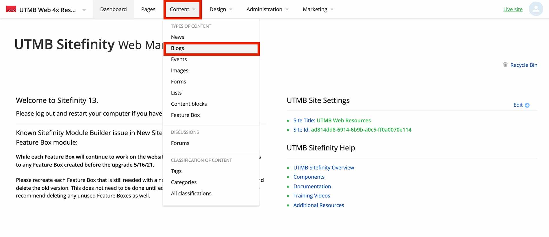
- Click the Create a Blog button
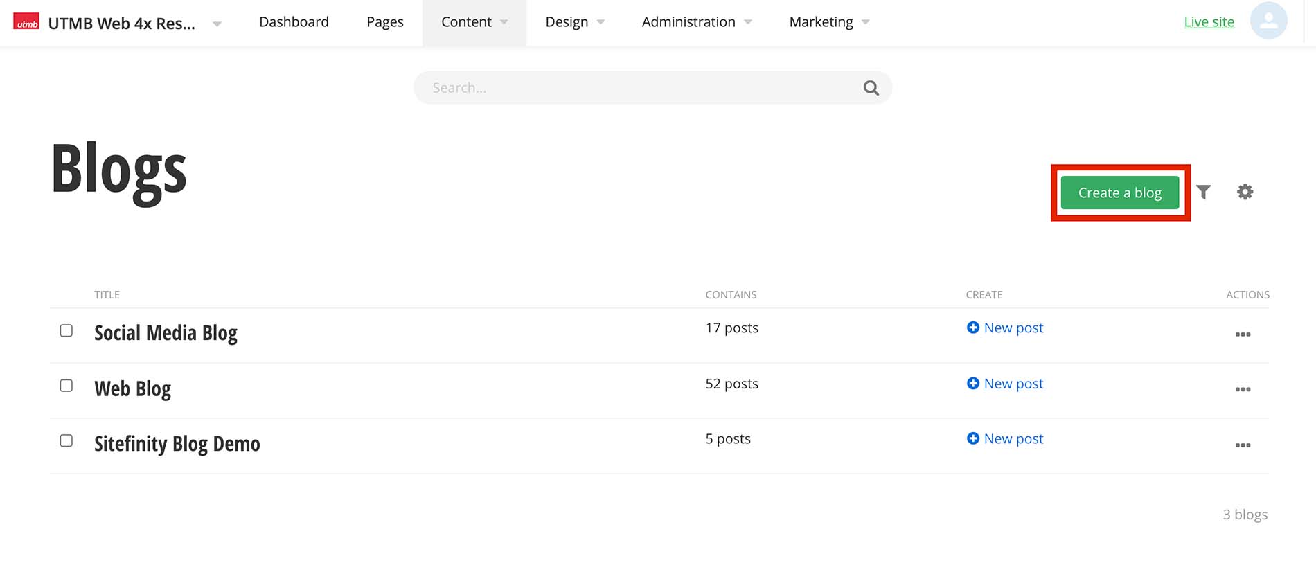
- Type the blog title and click the Create button
- Click the Content navigation menu item and then select Blogs
-
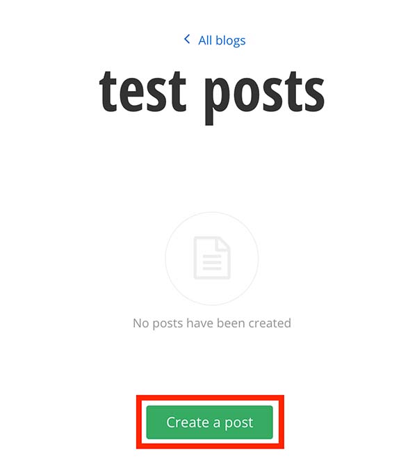
Create a Blog post
After you have created a Blog, you can now create blog posts.
Create blog posts
- Within the selected blog, Click the Create a post button
- Add a title. This will be displayed as your blog post title
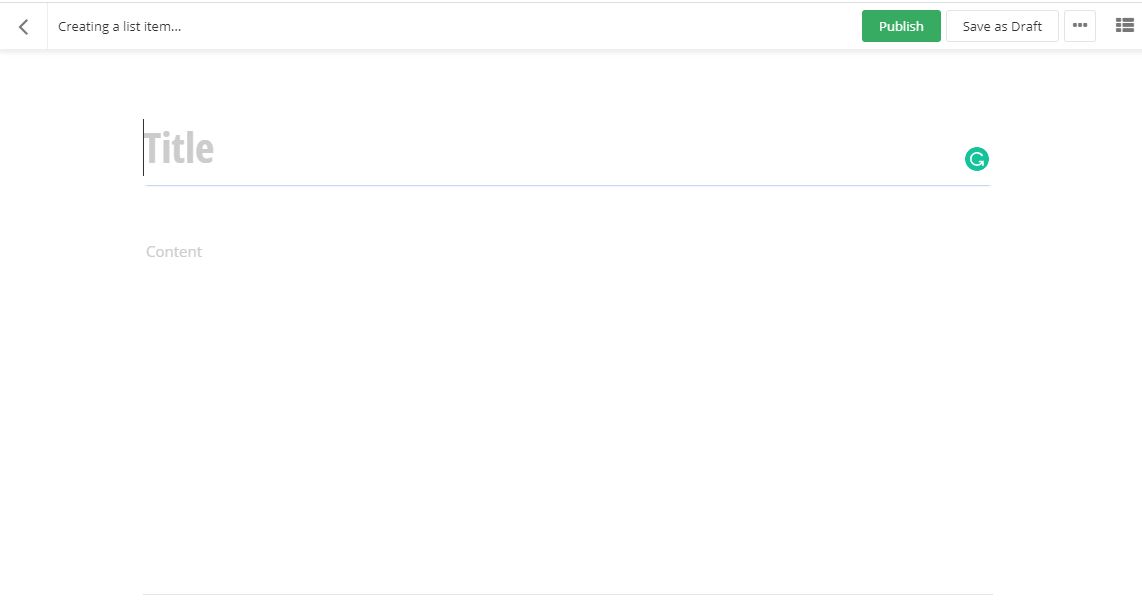
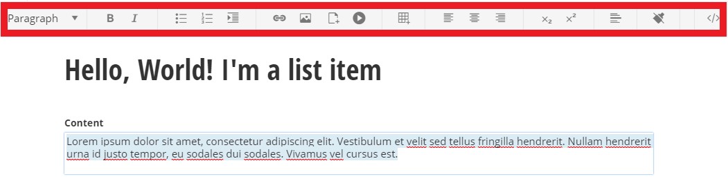
- Click in the content area. You have the option to use the formatting toolbar and/or edit the HTML by selecting the </> option on the far right of the toolbar. Type and format the content.
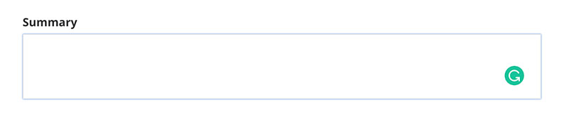
- Add a summary
- Add a featured image
- Under the Related Media section click the plus symbol
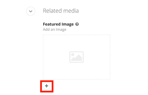
- Click Upload an image from your computer or Select an image from your library
- Click the Publish button
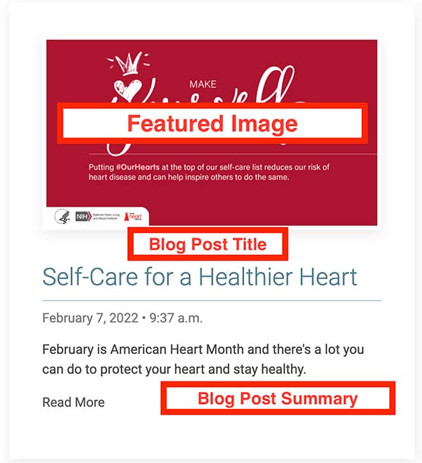
Blog post example showing featured image, blog post title, and summary:
-
Add Categories and Tags
Adding categories/tags allows the user to click on a desired category/tag to filter the content on the page. It can also filter specific items to be displayed on a page. You can add multiple categories and tags to content items such as lists, blogs, events, and images.

Adding Categories
- Click the plus symbol under the Categories section.
- Begin typing a category name to choose a predefined category, select create a category* (see note below), or select show all categories to select from the category list
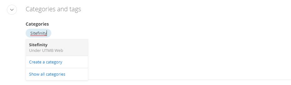
*NOTE: Any new category created should be saved under the site's parent category. Email sitefinity@utmb.edu for assistance in organizing new categories.
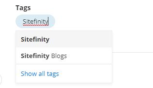
Adding Tags
- Click the plus symbol under the Tags section.
- Begin typing a tag name to create a new tag or select a predefined tag. You can also select Show all tags to search through the predefined tags.
-
Crediting author(s) and citing source
- Within the edit view of a blog post, under the Custom fields section, type in the author and/or article source information.
- Author: Set the author's name. e.g. - John Doe
- Article Source Name: Name of the external source where the original article was published
- Article Source Publish Date: Date the external article was originally published
- Article Source URL: add the website URL
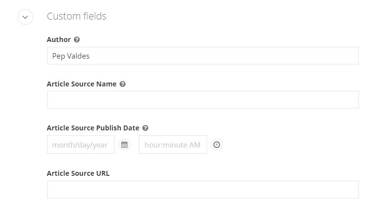
- Within the edit view of a blog post, under the Custom fields section, type in the author and/or article source information.
-
Redirect post to another webpage
Within the edit view of a blog or news post, you can redirect a post to another webpage. Note that any content in the content area will not display on a webpage.
- Under the Custom fields section, paste the URL in the Redirect URL field
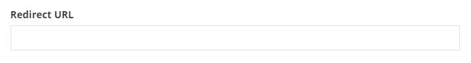
- Under the Custom fields section, paste the URL in the Redirect URL field
-
Create a Blog slider
Within the edit view of a blog post, you can add blog slider content that can be displayed on a page.
- Add a blog slider image
- Under the Related Media section click the Blog Slide Background Image plus symbol
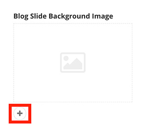
- Click Upload an image from your computer or Select an image from your library
- Under the Related Media section click the Blog Slide Background Image plus symbol
- Add the Blog Slide Title and Blog Slide Summary.
- Under the Custom Fields section add the title and summary if applicable. Keep both short.
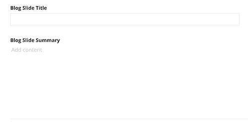
- Under the Custom Fields section add the title and summary if applicable. Keep both short.
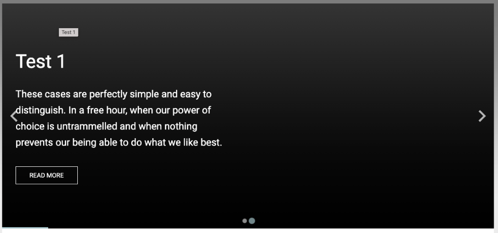
Blog slide example displayed on a webpage with default settings: If no content has been added to the Blog Slider fields in the edit view of a blog post, the slider will use the blog post Title and Summary fields, have a dark gray background, the text will be white with no card background behind the text and the button will be a transparent "read more".
- Add a blog slider image
-
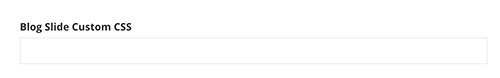
Customize Blog slider with CSS
Within the edit view of a blog post, CSS classes can be applied to affect the look of the individual slide, image, or content of a blog post.
Under the Custom fields section add classes to the Blog Slide Custom CSS field. Multiple CSS classes can be added but must be separated by a space. CSS classes can be found below.
Blog slide CSS classes
Classes with "sm" text will only affect small screens (smaller than 640px).
Classes with "md" text will only affect medium screens (641px to 1007px).
Classes with "lg" text will only affect large screens (1008px and larger).Card overlay color
- uk-overlay-default (White transparent background)
- uk-overlay-primary (Dark transparent background)
Card overlay placement
- uk-position-top
- uk-position-left
- uk-position-right
- uk-position-bottom
- uk-position-center
- uk-position-top-left
- uk-position-top-center
Slide Background Image Handling
- img-fill
- img-sm-fill
- img-md-fill
- img-lg-fill
- img-contain
- img-sm-contain
- img-md-contain
Content title text size, style and heading structure
- title-h1 (default)
- title-sm-h1
- title-md-h1
- title-lg-h1
- title-h2
- title-sm-h2
- title-md-h2
- title-lg-h2
- title-h3
- title-sm-h3
- title-md-h3
- title-lg-h3
- title-h4
Content summary text size
- summary-large
- summary-sm-large
- summary-md-large
- summary-lg-large
- summary-medium (default)
- summary-sm-medium
- summary-md-medium
Content text alignment
- text-left (default)
- text-right
- text-center
Content text color options
- content-red
- content-gray
- content-gray-light
- content-white (default)
- content-black
- content-blue
- content-blue-light
- content-teal
- content-teal-light
- content-orange
- content-orange-light
- content-green
- content-green-light
- content-gray-1
Card Overlay width (%-based)
- content-width-30
- content-width-sm-30
- content-width-md-30
- content-width-lg-30
- content-width-40
- content-width-sm-40
- content-width-md-40
- content-width-lg-40
- content-width-50 (default)
- content-width-sm-50
- content-width-md-50
- content-width-lg-50
- content-width-60
- content-width-sm-60
- content-width-md-60
- content-width-lg-60
Button text options
- btn-read-more (default)
- btn-read-article
- btn-learn-more
Button color and size options
- btn-default (default)
- btn-red
- btn-gray
- btn-gray-light
- btn-white
- btn-black
- btn-blue
- btn-orange
- btn-green
- btn-purple
- btn-teal
Background color + gradients
- red-bg
- gray-bg (default)
- gray-light-bg
- gray-mid-bg
- gray-dark-bg
- blue-bg
- blue-light-bg
- teal-bg
- teal-light-bg
- orange-bg
- orange-light-bg
- black-bg
- white-bg
- gray-1-bg
- gray-2-bg
- gray-3-bg
- gray-4-bg
-
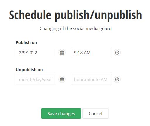
Scheduling to publish and/or unpublish
Within the edit view of a page or content item, you can schedule a post to publish and/or unpublish on a specific date.
- Click the ellipses button (...) on the top-right of the page. Then select Schedule publish/unpublish from the drop-down menu.
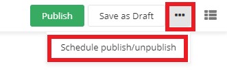
- Type or select the date and time you would like to publish the page or item. You can also type or select the date and time you would like to unpublish. Click the Save changes button
when complete.
- Click the ellipses button (...) on the top-right of the page. Then select Schedule publish/unpublish from the drop-down menu.
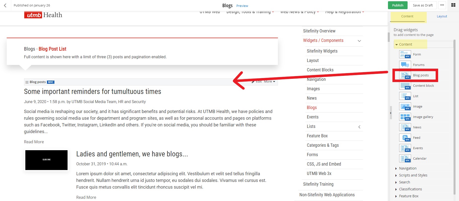
Add Blog Posts to a Page
-
Add Blog widget to a page
Within the edit view of a page, you can add the blog post widget and display blog posts.
- On the right side menu, click the Content tab, click the Content drop down menu and find the Blog posts widget. Click, hold and drag the Blog post widget onto the desired part of the
page, and then release the blog post widget.
- On the right side menu, click the Content tab, click the Content drop down menu and find the Blog posts widget. Click, hold and drag the Blog post widget onto the desired part of the
page, and then release the blog post widget.
-
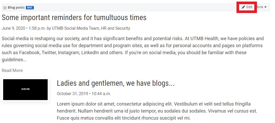
Selecting which Blogs to display
Within the edit view of a page, you can select which blog post(s) to display.
- After you have added the blog post widget to a page, click the Edit button on the widget
- Under the Content tab, select which blog posts to display
- From all blogs: This is the default setting. This will display all blog posts from all blogs on the website.
- From selected blogs only: you can specify which blogs to display
- From currently open blog: do not use this setting
- Selected blog posts: you can select one or more individual blog posts to display
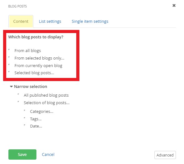
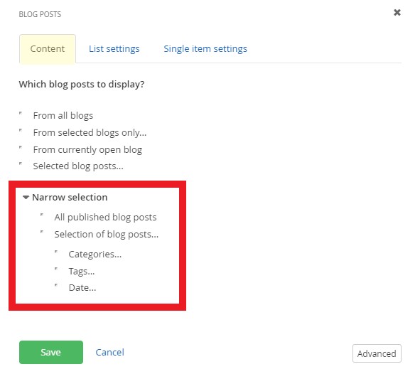
- Narrow selection further
- All published blog posts: This is the default setting. This will display all published blog posts.
- Selection of blog posts: you can add filters for categories, tags, and/or published dates. You must add categories and/or tags to the blog posts before you can add the filter to the blog post widget.
- Click the Save button when finished.
- After you have added the blog post widget to a page, click the Edit button on the widget
-
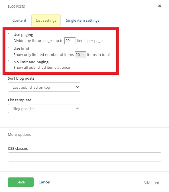
Set the blog post paging & limit the number of items to display
Within the edit view of a page, you can customize how blog posts display.
- After you have added the blog post widget to a page, click the Edit button on the widget
- Under the List settings tab, select the paging and limit settings.
- Use paging: This is the default setting with up to 20 items per page displaying. You can edit the number of items displayed.
- Use Limit: You can limit the number of items displayed.
- No limit and paging: Shows all published items at once. This setting is not recommended.
- After you have added the blog post widget to a page, click the Edit button on the widget
-
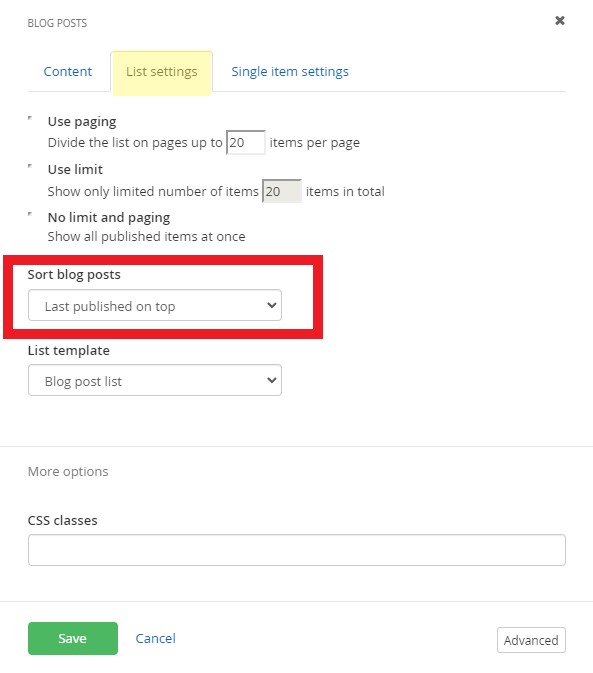
Sort blog posts on a page
Within the edit view of a page, you can sort blog posts with these settings:
- After you have added the blog post widget to a page, click the Edit button on the widget
- Under the List settings tab, select limit settings:
- Last published on top: This is the default setting. Sorts the latest articles that have been published in descending order by date.
- Last modified on top: Sorts the latest articles that have been edited and saved in descending order by date.
- By Title (A-Z): Sorts by the title field of the blog post.
- By Title (Z-A): Sorts by the title field of the blog post.
- As set manually: Sorts by the the order of the blog posts in the blog. You can manually reorder blog posts.
- As set in advanced mode: Do not use this setting
- After you have added the blog post widget to a page, click the Edit button on the widget
-
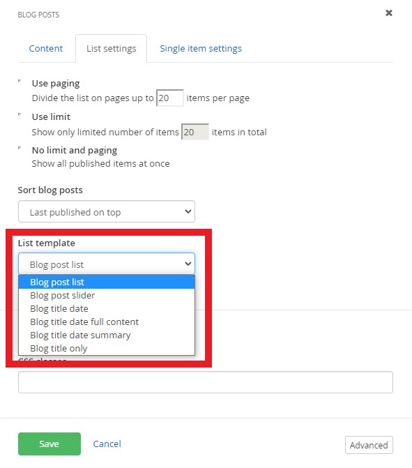
Select the blog post list template (layout)
Within the edit view of a page, you can customize how blog posts display.
- After you have added the blog post widget to a page, click the Edit button on the widget
- Under the List settings tab, select the list template. Learn more about the available templates.
- After you have added the blog post widget to a page, click the Edit button on the widget
-
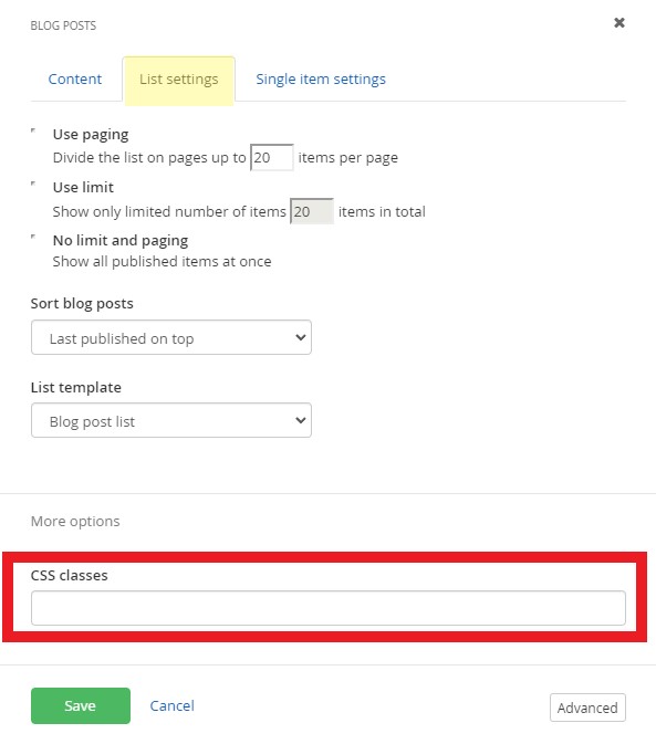
Add CSS classes to a blog widget
Within the edit view of a page, you can customize the style of the blog posts with pre-written CSS classes.
- After you have added the blog post widget to a page, click the Edit button on the widget
- Under the List settings tab, add CSS classes in the More options section.
- Insert CSS classes in the CSS classes field. Multiple CSS classes can be added but must be separated by a space. View pre-written classes for each available template.
- Insert CSS classes in the CSS classes field. Multiple CSS classes can be added but must be separated by a space. View pre-written classes for each available template.
- After you have added the blog post widget to a page, click the Edit button on the widget
-
Customize how the blog post article displays
Within the edit view of a page, you can customize how blog post articles display and select the page that it opens in. You must create a separate page with the blog post widget on it first.
- After you have added the blog post widget to a page, click the Edit button on the widget
- Under the Single item settings tab, select the page that the full article opens in.
- Auto-generated page: This is the default setting and will open the article within the same page. This setting is not recommended.
- Selected existing page: Select the article page with the blog post widget on it.
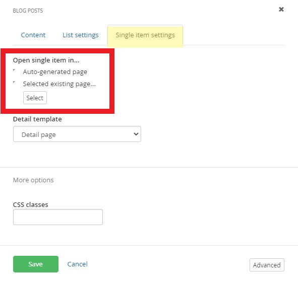
- You can also add custom CSS classes to the article under the More options section. View the blog posts classes and examples.
- After you have added the blog post widget to a page, click the Edit button on the widget