Sitefinity Layout Editor
The Sitefinity Layout Editor is a user-friendly and intuitive tool designed to help you easily define new content placeholders and create customize web page layouts using entirely the backend UI without needing to write code.
It is designed to make web page creation accessible and efficient, allowing you to focus on creating engaging content without worrying about the technical details.
Before learning about the Layout Editor be sure you have a good understanding of Columns & Grids.
Features:
- Drag-and-Drop Interface: Easily add, move, and arrange content blocks on your page by dragging and dropping elements. This interface supports nesting to allow user to create the desired layout.
- Column and Row Configuration: Easily configure columns and rows to structure your content. Adjust the width and alignment of columns to fit your design needs.
- Responsive Design: Ensure your pages look great on all devices with built-in responsive design features. You can preview and adjust the layout for different screen sizes using pre-defined classes.
- Versatile Containers: Add various types of content such as text (content block), images, videos, and any of the dynamic widgets.
- Customization Options: Add CSS classes to customize the appearance and behavior of each column or row.
Layout Views
The widget component template
Learn how to do it:
-
Adding layout elements
Within the edit view of a page or template, you can easily configure columns and rows to structure your content.- On the right side menu, click the Layout tab. Then select layout elements to drag-and-drop on to the page.
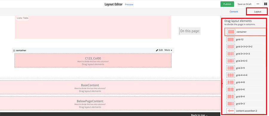
- Learn more about the layout options
- On the right side menu, click the Layout tab. Then select layout elements to drag-and-drop on to the page.
Page Containers
When templates are created they do not contain an "art board" area which constrains the content to any designated page width. This is by-design to allow website designers to decide how much of the screen width the content should take up and where the constraints should be located.
Page Container Layout regions assist in ensuring the page has the proper width and padding in a specific region before content Grid Layout regions are added. Below we will breakdown each option available and inform users of the typical usage:
Container Basic
Used to take up the full-width of the screen and add padding to the top and bottom of the container so the next nested items have space above and below.
Typical Usage: Add a colored background to a section of a website which stretches the full-width of the screen with no "white space" on the left of right of this section. Nest additional layout containers as needed to constrain the "art board" width.
Container
Used to take up 1400px (max) in the middle of the screen and add padding to the right and left of the container. This Container will constrain the content in line with the left edge of the UTMB logo and the right edge of the site navigation at the top of the webpages on desktop view.
Typical Usage: Add a container into a container-basic to create a 1400px wide/centered constrained area in a colored background to a section of a website which stretches the full-width of the screen with no "white space" on the left of right of the colored section.
Container Body
Used to take up 1400px (max) in the middle of the screen and add padding to the top and bottom of the container so the next nested items have space above and below. This Container will constrain the content in line with the left edge of the UTMB logo and the right edge of the site navigation at the top of the webpages on desktop view.
Typical Usage: Add a container body into any region following a full-width colored background design to create a 1400px wide/centered constrained white background area without needing to add additional padding or containers.
Container Reading Area
Used to take up 900px (max) in the middle of the screen and add padding to the top and bottom of the container so the next nested items have space above and below. This Container will constrain the content to a comfortable reading width (900px ma) on desktop view.
Typical Usage: Add a container reading area into any region following a full-width colored background design to create a 900px wide/centered constrained white background area without needing to add additional padding or containers to create an area of focus for a new topic or special content which may be text heavy.
Column Grids
3 Column Grid
grid-4+4+4
Lorem ipsum dolor sit amet, consectetur adipiscing elit. Vestibulum suscipit scelerisque neque ac rhoncus. Sed feugiat semper aliquam. Mauris sed arcu a eros rutrum tempor eu id lacus.
Lorem ipsum dolor sit amet, consectetur adipiscing elit. Vestibulum suscipit scelerisque neque ac rhoncus. Sed feugiat semper aliquam. Mauris sed arcu a eros rutrum tempor eu id lacus.
Lorem ipsum dolor sit amet, consectetur adipiscing elit. Vestibulum suscipit scelerisque neque ac rhoncus. Sed feugiat semper aliquam. Mauris sed arcu a eros rutrum tempor eu id lacus.
| All Grid Layout Options | ||||
|---|---|---|---|---|
| Name | Thumbnail | Number of Columns | ||
| grid-12 |  | 1 | ||
| grid-3+9 |  | 2 | ||
| grid-9+3 |  | 2 | ||
| grid-4+8 |  | 2 | ||
| grid-8+4 |  | 2 | ||
| grid-6+6 |  | 2 | ||
| grid-4+4+4 |  | 3 | ||
| grid-3+6+3 |  | 3 | ||
| grid-3+3+3+3 |  | 4 | ||
| grid-2+3+2+3+2 |  | 5 | ||
Note: Some columns classes can be adjusted to accommodate other combinations adding up to 12 units (like 5+7), however, be sure to test these combinations in preview mode to ensure they function as expected.
Content Tabs & Accordions
Tabs and accordions are both used to group and condense content on a web page. They each serve slightly different functions as outlined below.
Note: Avoid using tab and accordion layouts if:
- The content you are wanting to display is not part of a specific module like Blogs or Events. Instead, use the list widget to display the items using the Lists: Accordion Layout or Lists: Tabs Layout views for more flexibility and ease of use.
- Content needs to be compared side-by-side or if mobile view and simplicity are top priorities.
- The number of "panels" needed is over 5 or changes often. Content Tabs and Accordions are available in 2, 3, 4 or 5 panels. No additional panels can be added and, if the number of panels in the design needs to be changed, the content needs to be moved from the current layout element in to the new one with the desired number of panels.
3 Tabs
content-tabs-3
Content Area: Tab 1
Lorem ipsum dolor sit amet, consectetur adipiscing elit. Vestibulum suscipit scelerisque neque ac rhoncus. Sed feugiat semper aliquam. Mauris sed arcu a eros rutrum tempor eu id lacus. Aliquam porta id erat non molestie. Ut est nulla, dictum et augue ut, tempor suscipit sapien. Praesent tristique, dolor vitae convallis feugiat, odio libero blandit massa, eu porta neque sem molestie mauris. Duis sit amet eros finibus, porttitor urna eget, fermentum tortor. Nam augue mi, rhoncus eu lorem interdum, rutrum porta mi. Aliquam molestie gravida maximus
Content Area: Tab 2
Lorem ipsum dolor sit amet, consectetur adipiscing elit. Vestibulum suscipit scelerisque neque ac rhoncus. Sed feugiat semper aliquam. Mauris sed arcu a eros rutrum tempor eu id lacus. Aliquam porta id erat non molestie. Ut est nulla, dictum et augue ut, tempor suscipit sapien. Praesent tristique, dolor vitae convallis feugiat, odio libero blandit massa, eu porta neque sem molestie mauris. Duis sit amet eros finibus, porttitor urna eget, fermentum tortor. Nam augue mi, rhoncus eu lorem interdum, rutrum porta mi. Aliquam molestie gravida maximus
Content Area: Tab 3
Lorem ipsum dolor sit amet, consectetur adipiscing elit. Vestibulum suscipit scelerisque neque ac rhoncus. Sed feugiat semper aliquam. Mauris sed arcu a eros rutrum tempor eu id lacus. Aliquam porta id erat non molestie. Ut est nulla, dictum et augue ut, tempor suscipit sapien. Praesent tristique, dolor vitae convallis feugiat, odio libero blandit massa, eu porta neque sem molestie mauris. Duis sit amet eros finibus, porttitor urna eget, fermentum tortor. Nam augue mi, rhoncus eu lorem interdum, rutrum porta mi. Aliquam molestie gravida maximus
3 Accordion Panels
content-accordion-3
-
Accordion 1 Link
Content Area: Accordion 1
Lorem ipsum dolor sit amet, consectetur adipiscing elit. Vestibulum suscipit scelerisque neque ac rhoncus. Sed feugiat semper aliquam. Mauris sed arcu a eros rutrum tempor eu id lacus. Aliquam porta id erat non molestie. Ut est nulla, dictum et augue ut, tempor suscipit sapien. Praesent tristique, dolor vitae convallis feugiat, odio libero blandit massa, eu porta neque sem molestie mauris. Duis sit amet eros finibus, porttitor urna eget, fermentum tortor. Nam augue mi, rhoncus eu lorem interdum, rutrum porta mi. Aliquam molestie gravida maximus
-
Accordion 2 Link
Content Area: Accordion 2
Lorem ipsum dolor sit amet, consectetur adipiscing elit. Vestibulum suscipit scelerisque neque ac rhoncus. Sed feugiat semper aliquam. Mauris sed arcu a eros rutrum tempor eu id lacus. Aliquam porta id erat non molestie. Ut est nulla, dictum et augue ut, tempor suscipit sapien. Praesent tristique, dolor vitae convallis feugiat, odio libero blandit massa, eu porta neque sem molestie mauris. Duis sit amet eros finibus, porttitor urna eget, fermentum tortor. Nam augue mi, rhoncus eu lorem interdum, rutrum porta mi. Aliquam molestie gravida maximus
-
Accordion 3 Link
Content Area: Accordion 3
Lorem ipsum dolor sit amet, consectetur adipiscing elit. Vestibulum suscipit scelerisque neque ac rhoncus. Sed feugiat semper aliquam. Mauris sed arcu a eros rutrum tempor eu id lacus. Aliquam porta id erat non molestie. Ut est nulla, dictum et augue ut, tempor suscipit sapien. Praesent tristique, dolor vitae convallis feugiat, odio libero blandit massa, eu porta neque sem molestie mauris. Duis sit amet eros finibus, porttitor urna eget, fermentum tortor. Nam augue mi, rhoncus eu lorem interdum, rutrum porta mi. Aliquam molestie gravida maximus
Customizations
Customize with CSS Classes.
Learn how to do it:
-
Add CSS classes to a layout element
- In the edit view of the page, click edit on the layout element.
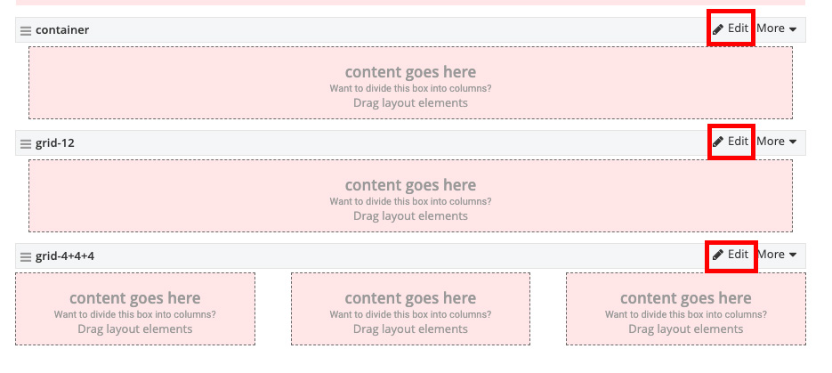
- Under the Classes tab, add pre-written CSS classes in the row, column, or container fields. Leave any predefined classes that
are automatically generated. Multiple CSS classes can be added but must be separated by a space.
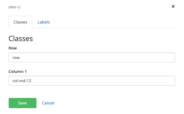
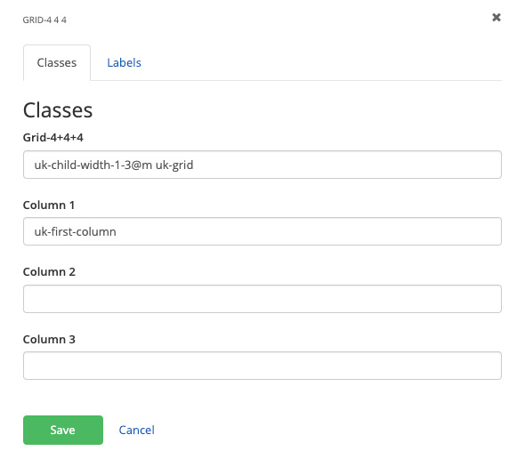
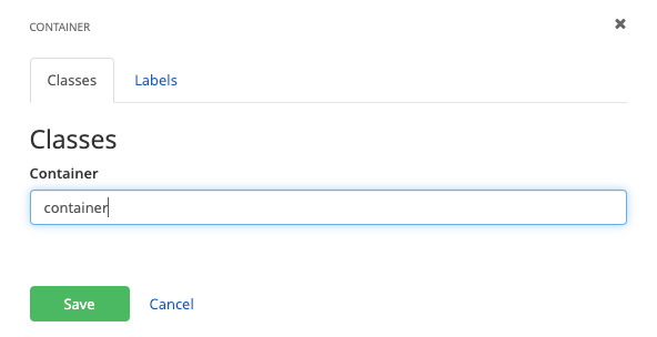
- Click the Save button.
- In the edit view of the page, click edit on the layout element.
-
Adding a background color to a layout element
- In the edit view of the page, click edit on the layout element.
- Under the Classes tab, add the desired background CSS classes in the row, column, or container fields. Leave any predefined classes that
are automatically generated. Multiple CSS classes can be added but must be separated by a space.
- Click the Save button.
- In the edit view of the page, click edit on the layout element.
Responsive Design
Columns can get manipulated so they layout differently depending on the screen size. Before attempting to manipulate the Layout Editor column classed be sure you have a good understanding of Columns & Grids, as well as Basic Responsive Design and the Breakpoints of UTMB's columns.
By default, all columns have classes applied to them so they will "break" or change at the medium screen size (≤ 959px wide) to stack all columns on top of one another. This means that at a landscape tablet size and larger screens the content will be in the designated columns, but in a portrait tablet size or smaller screens (like a smart phone), the content will be stacked and not in columns.
To control the number of columns at each screen size for each row of content, we can edit the classes applied to the each column grid group.
- While in Layout mode, click edit on the desired grid group. Note the default classes in the Columns.
- Column 1 will take up 3 units at a medium screen size and above (col-md-3)
- Column 2 will take up 6 units at a medium screen size and above (col-md-6)
- Column 3 will take up 3 units at a medium screen size and above (col-md-3)
- To change the way each column behaves at any given screen size, add the class for that column size and screen size, ensuring the numbers add up to 12 at each screen size. Note the classes in the provided example:
- Large Screen Size
- Column 1 will take up 3 units at a large screen size and above (col-lg-3)
- Column 2 will take up 3 units at a large screen size and above (col-lg-3)
- Column 3 will take up 6 units at a large screen size and above (col-lg-6)
- Medium Screen Size
- Column 1 will take up 4 units at a medium screen size and above (col-md-4)
- Column 2 will take up 4 units at a medium screen size and above (col-md-4)
- Column 3 will take up 4 units at a medium screen size and above (col-md-4)
- Small Screen Size
- Column 3 will take up 12 units at a small screen size and above (col-sm-12)
- Column 1 will take up 6 units at a small screen size and above (col-sm-6)
- Column 2 will take up 6 units at a small screen size and above (col-sm-6)
- Extra Small Screen Size
- Column 1 will take up 6 units at an extra small screen size and above (col-xs-6)
- Column 2 will take up 6 units at an extra small screen size and above (col-xs-6)
- Column 3 will take up 12 units at an extra small screen size and above due to not having a specific class applied and the default is 12 units
- Large Screen Size

Squeeze the screen down slowly to a mobile phone size to see the difference in the next 2 examples, scroll as needed.
Default 3 Column Layout
grid-3+6+3
Column 1
Lorem ipsum dolor sit amet, consectetur adipiscing elit. Vestibulum suscipit scelerisque neque ac rhoncus. Sed feugiat semper aliquam. Praesent tristique, dolor vitae convallis feugiat, odio libero blandit massa, eu porta neque sem molestie mauris. Duis sit amet eros finibus, porttitor urna eget, fermentum tortor.
Column 2
Lorem ipsum dolor sit amet, consectetur adipiscing elit. Vestibulum suscipit scelerisque neque ac rhoncus. Sed feugiat semper aliquam. Praesent tristique, dolor vitae convallis feugiat, odio libero blandit massa, eu porta neque sem molestie mauris. Duis sit amet eros finibus, porttitor urna eget, fermentum tortor. Nam augue mi, rhoncus eu lorem interdum, rutrum porta mi.s
Lorem ipsum dolor sit amet, consectetur adipiscing elit. Vestibulum suscipit scelerisque neque ac rhoncus. Sed feugiat semper aliquam. Praesent tristique, dolor vitae convallis feugiat, odio libero blandit massa, eu porta neque sem molestie mauris. Duis sit amet eros finibus, porttitor urna eget, fermentum tortor. Nam augue mi, rhoncus eu lorem interdum, rutrum porta mi.s
Column 3
Lorem ipsum dolor sit amet, consectetur adipiscing elit. Vestibulum suscipit scelerisque neque ac rhoncus. Sed feugiat semper aliquam. Praesent tristique, dolor vitae convallis feugiat, odio libero blandit massa, eu porta neque sem molestie mauris. Duis sit amet eros finibus, porttitor urna eget, fermentum tortor.
Customized 3 Column Layout
start with grid-3+6+3, edit for responsive classes
Column 1
Lorem ipsum dolor sit amet, consectetur adipiscing elit. Vestibulum suscipit scelerisque neque ac rhoncus. Sed feugiat semper aliquam.
Column 2
Lorem ipsum dolor sit amet, consectetur adipiscing elit. Vestibulum suscipit scelerisque neque ac rhoncus. Sed feugiat semper aliquam.
Column 3
Lorem ipsum dolor sit amet, consectetur adipiscing elit. Vestibulum suscipit scelerisque neque ac rhoncus. Sed feugiat semper aliquam. Praesent tristique, dolor vitae convallis feugiat, odio libero blandit massa, eu porta neque sem molestie mauris. Duis sit amet eros finibus, porttitor urna eget, fermentum tortor.
| The following pre-written classes work for all columns: | ||||
|---|---|---|---|---|
| Extra small, ≤639px wide | Small, ≥640px wide | Medium, ≥960px wide | Large, ≥1200px wide | Extra Large, ≥1600px wide |
| col-xs-1 | col-sm-1 | col-md-1 | col-lg-1 | col-xl-1 |
| col-xs-2 | col-sm-2 | col-md-2 | col-lg-2 | col-xl-2 |
| col-xs-3 | col-sm-3 | col-md-3 | col-lg-3 | col-xl-3 |
| col-xs-4 | col-sm-4 | col-md-4 | col-lg-4 | col-xl-4 |
| col-xs-5 | col-sm-5 | col-md-5 | col-lg-5 | col-xl-5 |
| col-xs-6 | col-sm-6 | col-md-6 | col-lg-6 | col-xl-6 |
| col-xs-7 | col-sm-7 | col-md-7 | col-lg-7 | col-xl-7 |
| col-xs-8 | col-sm-8 | col-md-8 | col-lg-8 | col-xl-8 |
| col-xs-9 | col-sm-9 | col-md-9 | col-lg-9 | col-xl-9 |
| col-xs-10 | col-sm-10 | col-md-10 | col-lg-10 | col-xl-10 |
| col-xs-11 | col-sm-11 | col-md-11 | col-lg-11 | col-xl-11 |
| col-xs-12 | col-sm-12 | col-md-12 | col-lg-12 | col-xl-12 |
Backgrounds & Custom Classes
Backgrounds
Classes are available for brand color backgrounds, gradient background to be used in conjunction with brand colors and patterned backgrounds. With some basic CSS and HTML knowledge, users can also add background images and videos.
Padding Classes
Additional padding may be needed to add spacing between elements to enhance the design and user experience. The UTMB base styles include padding classes which can be added to content layout regions, content blocks and modules. These classes are written in increments of 5px and could affect the entire element or just one side. Stacking 2 or more classes is possible to achieve the desired layout.
| All Sides | Top | Right | Bottom | Left | |
|---|---|---|---|---|---|
| Range in 5px increments | 0-150px | 0-150px | 0-150px | 0-150px | 0-150px |
| Class example | padding-15 | padding-top-15 | padding-right-15 | padding-bottom-15 | padding-left-15 |
Training
Create and Edit Layouts
-
Adding layout elements
Within the edit view of a page or template, you can easily configure columns and rows to structure your content.
- On the right side menu, click the Layout tab. Then select layout elements to drag-and-drop on to the page.
- Learn more about the layout options
- On the right side menu, click the Layout tab. Then select layout elements to drag-and-drop on to the page.
-
Add CSS classes to a layout element
- In the edit view of the page, click edit on the layout element.
- Under the Classes tab, add pre-written CSS classes in the row, column, or container fields. Leave any predefined classes that
are automatically generated. Multiple CSS classes can be added but must be separated by a space.
- Click the Save button.
- In the edit view of the page, click edit on the layout element.
-
Adding a background color to a layout element
- In the edit view of the page, click edit on the layout element.
- Under the Classes tab, add the desired background CSS classes in the row, column, or container fields. Leave any predefined classes that
are automatically generated. Multiple CSS classes can be added but must be separated by a space.
- Click the Save button.
- In the edit view of the page, click edit on the layout element.