Sitefinity How-tos
Learn how to create content
Images
Images basics
-
Optimize images for the web
Image File Type Options
There are three primary file types used in Sitefinity we’ll want to focus on for saving images, optimized for the web: GIF, JPG and PNG. Each file type has its own strengths and weaknesses and it is very important to know and keep these in mind when saving an image. Here are a few details:
- GIFs are not for high-quality images, but you can use animated GIFs
- JPGs can be optimized to a very small file size while keeping the high quality of an image
- PNGs are typically used when a transparent background is needed
Saving Images Properly
Large images on a web page take longer to load. By “large”, we are referring to file size rather than the dimensions of an image, i.e. the value in KB, MB, GB etc. Users expect a webpage to load in under 2 seconds, and most will abandon a page that takes more than 3 seconds to load. It’s important that your images are small enough to ensure a speedy site. There are three things you can do to properly optimize your images for your web site:
- Make the image the proper proportions and dimensions
You will need to determine what is the largest size your image will be in all responsive views (i.e. phone, tablet or desktop). - Save the image “for the web”
It is possible to reduce the size without reducing the quality of the image on a screen. This requires changing the image resolution down to 72 PPI without losing the proper final dimensions or proportions and then compressing the image. - Compress the image
You can do this with Photoshop or other online tools like www.tinyjpg.com, www.tinypng.com or https://pixlr.com/e/. The goal is to get large “hero” images under 100KB, and images smaller than 800px wide under 50KB. The smaller the file size, the less data people have to load on the browser. - Recommended image dimensions
- Fullscreen banner: 1900 px wide by 550 px high
- Featured image of a blog or news post: 900 px wide by 400 px high
- Image floated left or right within a content block: 400 px wide
Images of Text
Genuine text is much more flexible than images: It can be resized without losing clarity, and background and text colors can be modified to suit the reading preferences of users. Images are more likely to distort and pixelate when resized. In those rare situations where images of text must be used, the text alternative must contain the same text presented in the image.
If you would like to have text float over a banner, please review how to create a blog slider.
-
Upload images to a library
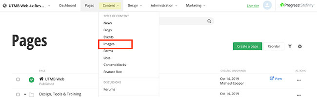
- Click the Content navigation menu item and then select Images
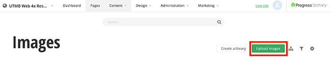
- Click the Upload images button
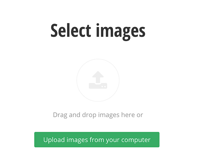
- Drag and drop images or click the Upload images from your computer button to select images.
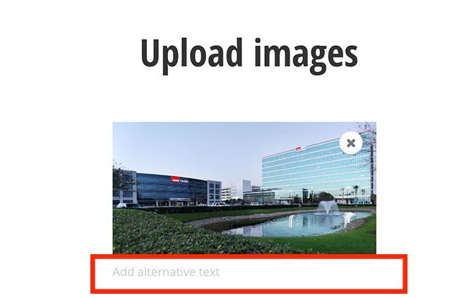
- Add alternative text. Alt text (alternative text) is a word or phrase that can be inserted as an attribute in an HTML (Hypertext Markup Language) document to tell website viewers the nature or contents of an image.
- Select the pencil icon to either select an existing gallery or create a new one.
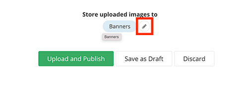
- Click the Upload and Publish button when finished.
- Click the Content navigation menu item and then select Images
-
Editing images in Photoshop for the web
In the example below, the image is 3.4MB in file size (that's huge!) and the dimensions are 5760px by 3840px.
Cropping the image to the correct proportions:
- When you open the image in Photoshop, on the left you will see the tools available to you.
- Select the crop tool (green square shown in the image below). Your image will then show crop marks on the edges of the view finder, and you can set the crop ratio (or proportions) on the top bar (red oval shown in the image below). For this example, the ratio was set to 1100x450 because that is the final desired size of the image.
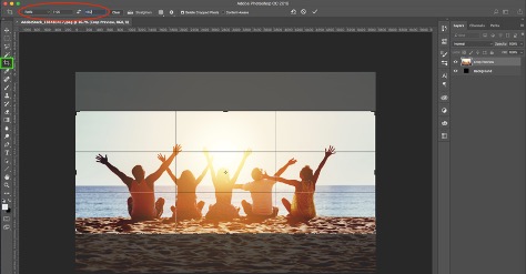
- You can then move the crop area around and select any area in the image.
- Hit enter, and the image is cropped.
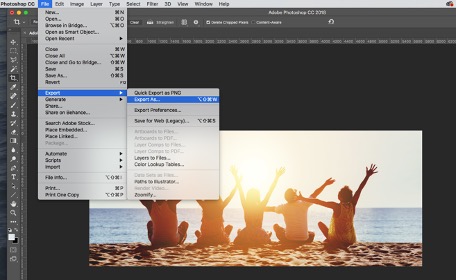
Save the image:
- Next, click ‘File > Export > Export As…’
- Now, you can optimize the web image by changing its dimensions (image size: blue box shown in the image below). In the example below the dimensions were changed from width 5760px and height 3840px to width 1100px and the height automatically adjusted to 450px. However, the file size is still a little large at 363KB.
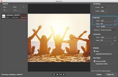
- Bringing down the “Quality” of the image will help with this. On the right side of the window, you will see the “Quality” dropdown, click that and you will have the ability to alter the quality by sliding the little triangle to the left (blue oval). You will see the file size go down as the quality refreshes (red box). At 100% zoomed, make sure the image does not begin to look pixelated. In the example below, the image is reduced to 29% quality and 51.2KB without being too pixelated.
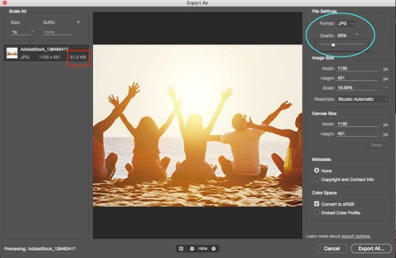
- Click ‘Export All’, use a name that is meaningful and save it.
-
Editing images in Pixlr for the web
Pixlr is a free online photo editing tool.
Use the Editor Option:
- Do not make an account or save the image to an account
- This site will allow you 3 free downloads per day, per browser (clearing your cache may allow for more).
Open image:
- Click the Open Image button and select the image that is stored on your device
Crop the image:
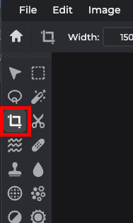
- Click the crop tool in the left side toolbar
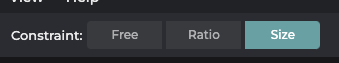
- In the upper toolbar menu, click the Size button.
- Add the desired width in the W field and height in the H field.
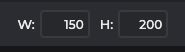
- Adjust the crop box on the image to the desired crop by dragging the corners.
- Then click Apply or hit Enter on your keyboard.

Save the image:
- Next, click File (top-left hand corner) and then Save from the drop-down menu
- Change the Quality of the image to the lowest setting without causing pixelation or losing definition by sliding the circle on the bar to the left. As this change is made, you will see the “size” number below the image change (12kb in the example below). It is also okay to increase the quality if the file size is small.
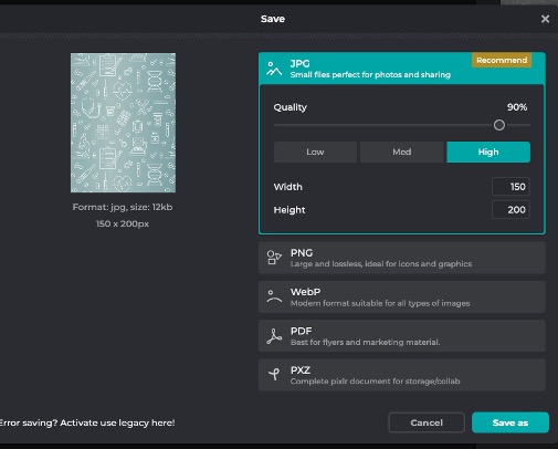
- Click Save as and save it to your device. (Click the X on the pop-up.)
Lists
Lists are dynamic! Use lists to display a lot of information or just a button with a few words! See them in action: accordion lists, link lists, link card lists, panel lists, tabs lists and simple lists.
Create and Edit Lists
-
Create a List and List items
Create a List
You can create multiple lists with multiple list items within each list.
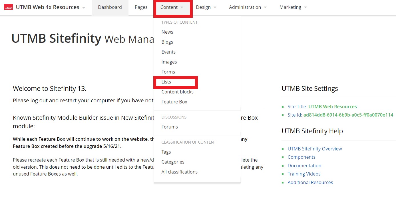
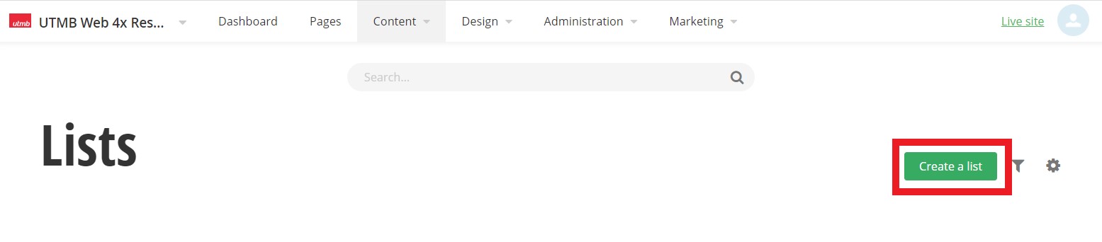
- Click the Content navigation menu item and then select Lists
- Click the Create a list button
- Type a title and click the Create button
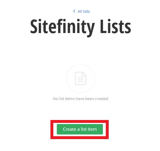
After you have created a list, you can now create list items.
Create List items
- Within a list, click the Create a list item button
- Add a title. This will be displayed as your list item title
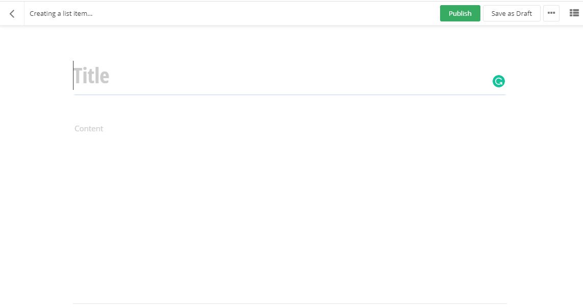
- Click the Publish button
- Click the Content navigation menu item and then select Lists
-
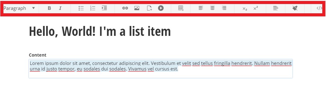
Add content to a list item
Within the edit view of a list item, you have the option to use the formatting toolbar and/or edit the HTML by selecting the </> option on the far right of the toolbar.
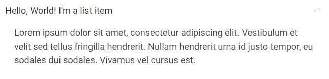
Examples of how this content displays on a page:
-
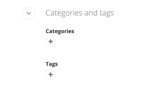
Add Categories and Tags
Adding categories/tags allows the user to click on a desired category/tag to filter the content on the page. It can also filter specific items to be displayed on a page. You can add multiple categories and tags to content items such as lists, blogs, events, and images.

Adding Categories
- Click the plus symbol under the Categories section.
- Begin typing a category name to choose a predefined category, select create a category* (see note below), or select show all categories to select from the category list
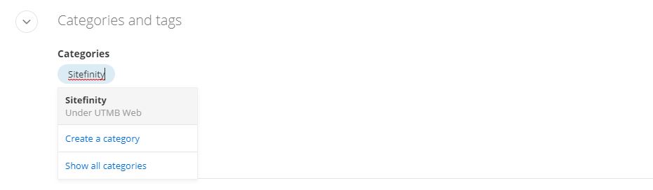
*NOTE: Any new category created should be saved under the site's parent category. Email sitefinity@utmb.edu for assistance in organizing new categories.
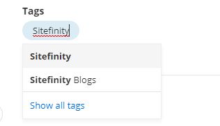
Adding Tags
- Click the plus symbol under the Tags section.
- Begin typing a tag name to create a new tag or select a predefined tag. You can also select Show all tags to search through the predefined tags.
-
Make a list item a link
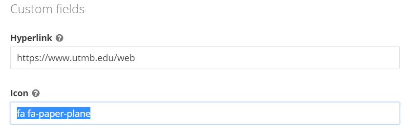
- Within the edit view of a list item, under the Custom fields section, type or paste the hyperlink into the Hyperlink field.

-
Add icons to list items
- Copy the class name inside the quotation marks from the selected icon available in the Font Awesome online library
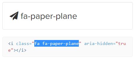
- Within the edit view of a list item, paste the class name into the Icon field under the Custom fields section of the list item
- Further customize the icon color by adding an icon color class to the CSS area. See Other Color Options.
Need to add an icon to the HTML code? View the icons style guide
- Copy the class name inside the quotation marks from the selected icon available in the Font Awesome online library
-
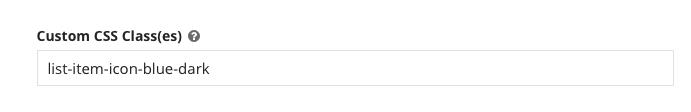
Add custom CSS classes to a list item
- Within the edit view of a list item, add the class name(s) into the Custom CSS Class(es) field under the Custom fields section of the list item.
- If multiple classes are being added list them single space separated as shown in the example below:
-field.png?sfvrsn=7e801f56_1)
-
Open list item link in new window
- Within the edit view of a list item, add the class name link-new-window into the Custom CSS Class(es) field under the Custom fields section of the list item.
- If multiple classes are being added list them single space separated as shown in the example below:
-
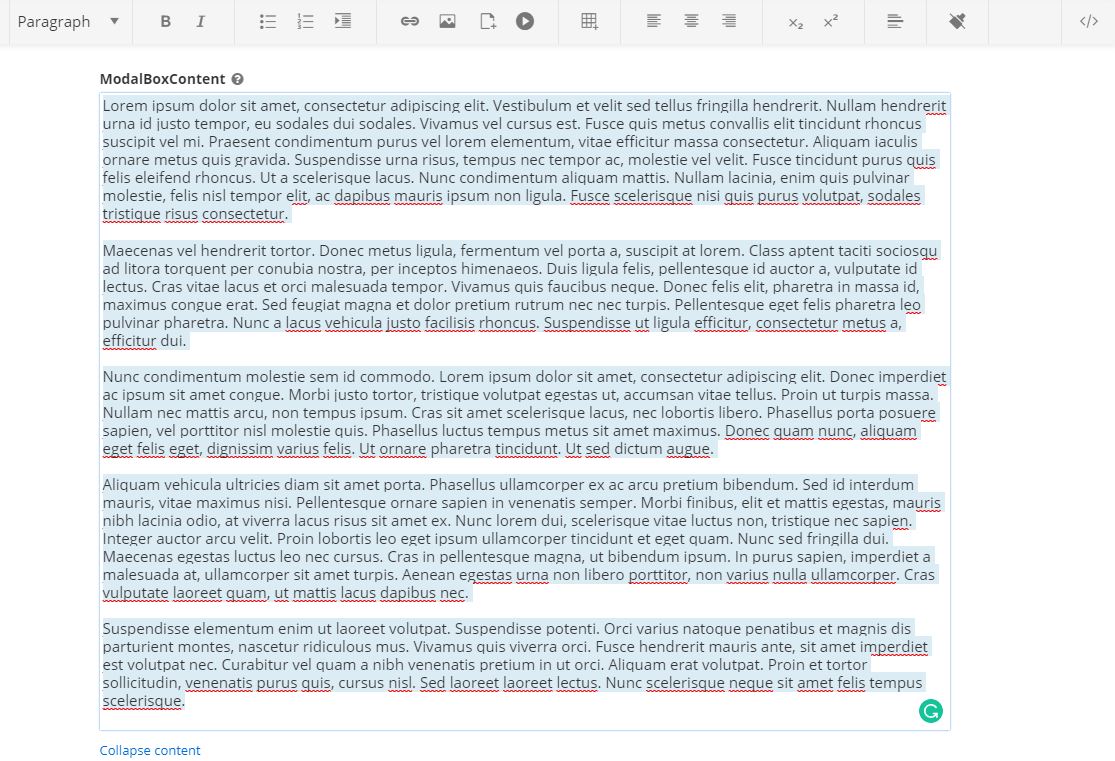
Add Modal box content to a list item
This content will display inside a modal box when the list item is selected.
- Within the edit view of a list item, under the Custom fields section, you must add # into the Hyperlink field.
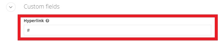
- Add content to the ModalBoxContent field. You can format content similar to the content area of a list item.
- Within the edit view of a list item, under the Custom fields section, you must add # into the Hyperlink field.
-
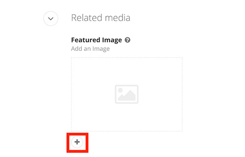
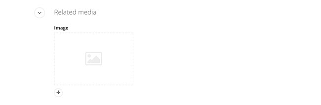
Add an image to a list item
- Within the edit view of a list item, under the Related media section click the plus symbol.
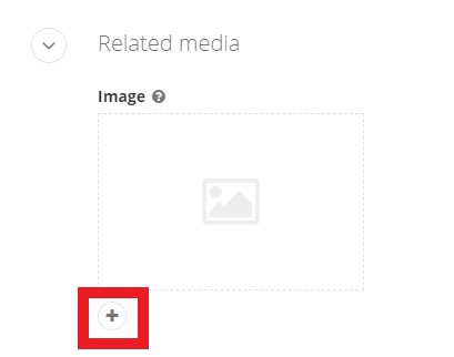
- Click Upload an image from your computer or Select an image from your library
Images can also be added to the content and modal box fields.
- Within the edit view of a list item, under the Related media section click the plus symbol.
-
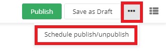
Scheduling to publish and/or unpublish
Within the edit view of a page or content item, you can schedule a post to publish and/or unpublish on a specific date.
- Click the ellipses button (...) on the top-right of the page. Then select Schedule publish/unpublish from the drop-down menu.
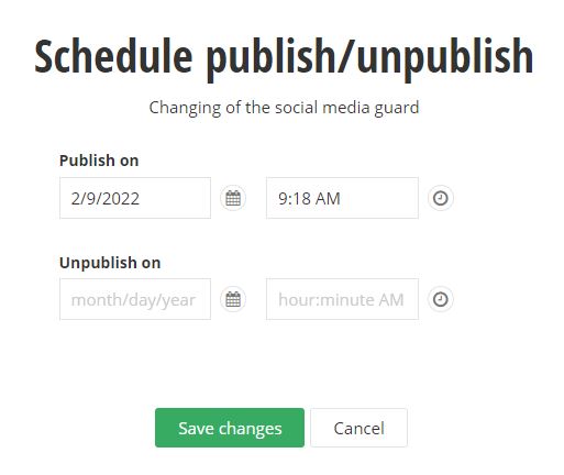
- Type or select the date and time you would like to publish the page or item. You can also type or select the date and time you would like to unpublish. Click the Save changes button
when complete.
- Click the ellipses button (...) on the top-right of the page. Then select Schedule publish/unpublish from the drop-down menu.
-
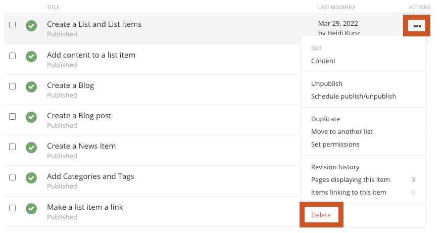
Delete or unpublish a List Item
To remove a list item from a website you can delete or unpublish them. Unpublished items can be republished; deleted items cannot be recovered.
- Click the Content navigation menu item and then select Lists
- Click the List title that house the list items that you want to remove.
- Select delete or unpublish:
- To delete:
- Click the ellipses button (...) on the top-right of the list item you want to remove. Then select Delete from the drop-down menu.
OR
- Click the ellipses button (...) on the top-right of the list item you want to remove. Then select Delete from the drop-down menu.
- To Unpublish:
- Click the ellipses button (...) on the top-right of the list item you want to remove. Then select Unpublish or Schedule publish/unpublish from the drop-down menu.
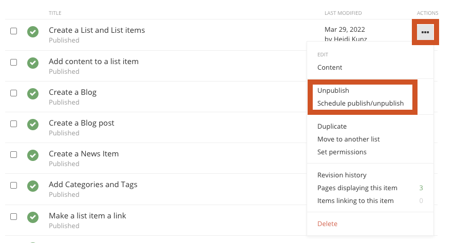
- Click the ellipses button (...) on the top-right of the list item you want to remove. Then select Unpublish or Schedule publish/unpublish from the drop-down menu.
- To delete:
- Click the Content navigation menu item and then select Lists
Always click the Publish, Save as Draft or Schedule when you are finished editing a list item or page to save your work.
See the Web Style Guide for HTML lists.
Related Training Videos
Blogs
See the various layout templates for the Blog posts widget component.
Create and edit Blogs
-
Create a Blog
Create a Blog
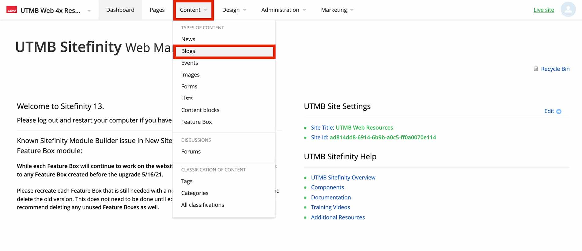
- Click the Content navigation menu item and then select Blogs
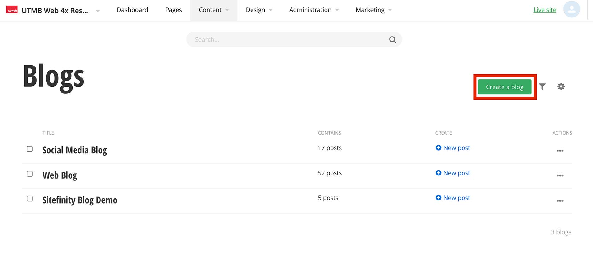
- Click the Create a Blog button
- Type the blog title and click the Create button
- Click the Content navigation menu item and then select Blogs
-
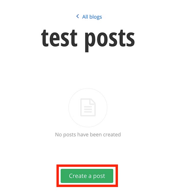
Create a Blog post
After you have created a Blog, you can now create blog posts.
Create blog posts
- Within the selected blog, Click the Create a post button
- Add a title. This will be displayed as your blog post title
- Click in the content area. You have the option to use the formatting toolbar and/or edit the HTML by selecting the </> option on the far right of the toolbar. Type and format the content.
- Add a summary
- Add a featured image
- Under the Related Media section click the plus symbol
- Click Upload an image from your computer or Select an image from your library
- Click the Publish button
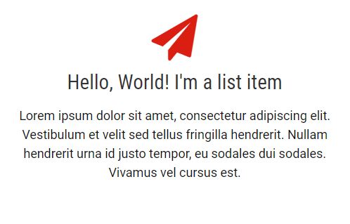
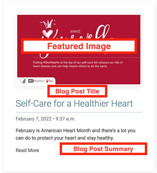
Blog post example showing featured image, blog post title, and summary:
-
Add Categories and Tags
Adding categories/tags allows the user to click on a desired category/tag to filter the content on the page. It can also filter specific items to be displayed on a page. You can add multiple categories and tags to content items such as lists, blogs, events, and images.
Adding Categories
- Click the plus symbol under the Categories section.
- Begin typing a category name to choose a predefined category, select create a category* (see note below), or select show all categories to select from the category list
*NOTE: Any new category created should be saved under the site's parent category. Email sitefinity@utmb.edu for assistance in organizing new categories.
Adding Tags
- Click the plus symbol under the Tags section.
- Begin typing a tag name to create a new tag or select a predefined tag. You can also select Show all tags to search through the predefined tags.
-
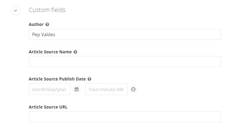
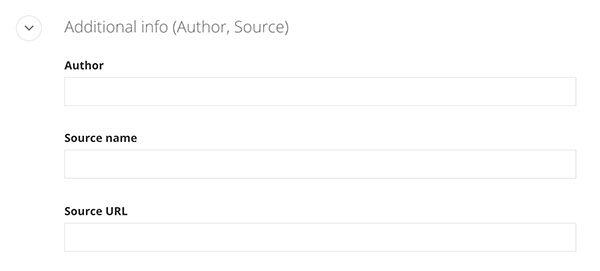
Crediting author(s) and citing source
- Within the edit view of a blog post, under the Custom fields section, type in the author and/or article source information.
- Author: Set the author's name. e.g. - John Doe
- Article Source Name: Name of the external source where the original article was published
- Article Source Publish Date: Date the external article was originally published
- Article Source URL: add the website URL
- Within the edit view of a blog post, under the Custom fields section, type in the author and/or article source information.
-
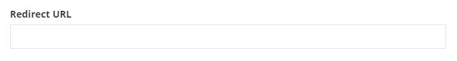
Redirect post to another webpage
Within the edit view of a blog or news post, you can redirect a post to another webpage. Note that any content in the content area will not display on a webpage.
- Under the Custom fields section, paste the URL in the Redirect URL field
- Under the Custom fields section, paste the URL in the Redirect URL field
-
Create a Blog slider
Within the edit view of a blog post, you can add blog slider content that can be displayed on a page.
- Add a blog slider image
- Under the Related Media section click the Blog Slide Background Image plus symbol
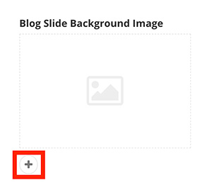
- Click Upload an image from your computer or Select an image from your library
- Under the Related Media section click the Blog Slide Background Image plus symbol
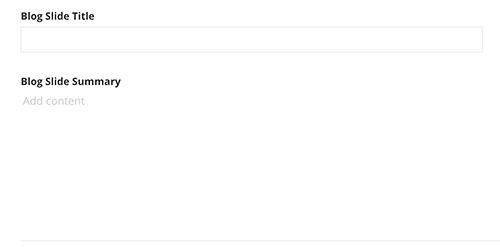
- Add the Blog Slide Title and Blog Slide Summary.
- Under the Custom Fields section add the title and summary if applicable. Keep both short.
- Under the Custom Fields section add the title and summary if applicable. Keep both short.
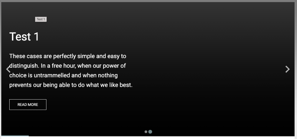
Blog slide example displayed on a webpage with default settings: If no content has been added to the Blog Slider fields in the edit view of a blog post, the slider will use the blog post Title and Summary fields, have a dark gray background, the text will be white with no card background behind the text and the button will be a transparent "read more".
- Add a blog slider image
-
Customize Blog slider with CSS
Within the edit view of a blog post, CSS classes can be applied to affect the look of the individual slide, image, or content of a blog post.
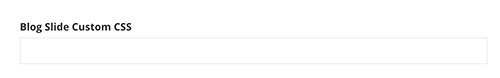
Under the Custom fields section add classes to the Blog Slide Custom CSS field. Multiple CSS classes can be added but must be separated by a space. CSS classes can be found below.
Blog slide CSS classes
Classes with "sm" text will only affect small screens (smaller than 640px).
Classes with "md" text will only affect medium screens (641px to 1007px).
Classes with "lg" text will only affect large screens (1008px and larger).Card overlay color
- uk-overlay-default (White transparent background)
- uk-overlay-primary (Dark transparent background)
Card overlay placement
- uk-position-top
- uk-position-left
- uk-position-right
- uk-position-bottom
- uk-position-center
- uk-position-top-left
- uk-position-top-center
Slide Background Image Handling
- img-fill
- img-sm-fill
- img-md-fill
- img-lg-fill
- img-contain
- img-sm-contain
- img-md-contain
Content title text size, style and heading structure
- title-h1 (default)
- title-sm-h1
- title-md-h1
- title-lg-h1
- title-h2
- title-sm-h2
- title-md-h2
- title-lg-h2
- title-h3
- title-sm-h3
- title-md-h3
- title-lg-h3
- title-h4
Content summary text size
- summary-large
- summary-sm-large
- summary-md-large
- summary-lg-large
- summary-medium (default)
- summary-sm-medium
- summary-md-medium
Content text alignment
- text-left (default)
- text-right
- text-center
Content text color options
- content-red
- content-gray
- content-gray-light
- content-white (default)
- content-black
- content-blue
- content-blue-light
- content-teal
- content-teal-light
- content-orange
- content-orange-light
- content-green
- content-green-light
- content-gray-1
Card Overlay width (%-based)
- content-width-30
- content-width-sm-30
- content-width-md-30
- content-width-lg-30
- content-width-40
- content-width-sm-40
- content-width-md-40
- content-width-lg-40
- content-width-50 (default)
- content-width-sm-50
- content-width-md-50
- content-width-lg-50
- content-width-60
- content-width-sm-60
- content-width-md-60
- content-width-lg-60
Button text options
- btn-read-more (default)
- btn-read-article
- btn-learn-more
Button color and size options
- btn-default (default)
- btn-red
- btn-gray
- btn-gray-light
- btn-white
- btn-black
- btn-blue
- btn-orange
- btn-green
- btn-purple
- btn-teal
Background color + gradients
- red-bg
- gray-bg (default)
- gray-light-bg
- gray-mid-bg
- gray-dark-bg
- blue-bg
- blue-light-bg
- teal-bg
- teal-light-bg
- orange-bg
- orange-light-bg
- black-bg
- white-bg
- gray-1-bg
- gray-2-bg
- gray-3-bg
- gray-4-bg
-
Scheduling to publish and/or unpublish
Within the edit view of a page or content item, you can schedule a post to publish and/or unpublish on a specific date.
- Click the ellipses button (...) on the top-right of the page. Then select Schedule publish/unpublish from the drop-down menu.
- Type or select the date and time you would like to publish the page or item. You can also type or select the date and time you would like to unpublish. Click the Save changes button
when complete.
- Click the ellipses button (...) on the top-right of the page. Then select Schedule publish/unpublish from the drop-down menu.
Always click the Publish, Save as Draft or Schedule when you are finished editing a blog post or page to save your work.
Related Training Videos
News
See the various layout templates for the News widget component.
Create and Edit News
-
Create a News Item
Unlike Blogs, you can only have one News Feed with multiple news items.
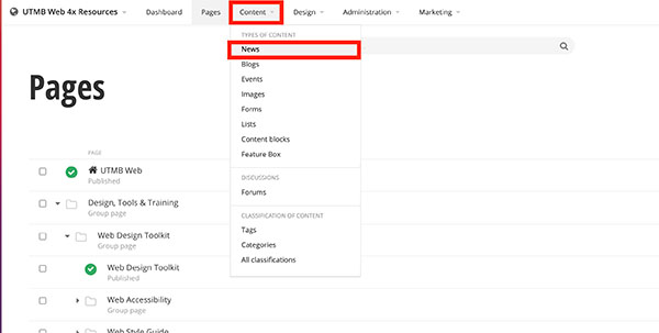
- Click the Content navigation menu item and then select News
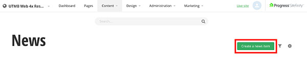
- Click the Create a News Item button
- Add a title. This will be displayed as your news post title
- Click in the content area. You have the option to use the formatting toolbar and/or edit the HTML by selecting the </> option on the far right of the toolbar. Type and format the content.
- Add a summary
- Add a featured image
- Under the Related Media section click the plus symbol
- Click Upload an image from your computer or Select an image from your library
- Click the Publish button
- Click the Content navigation menu item and then select News
-
Add Categories and Tags
Adding categories/tags allows the user to click on a desired category/tag to filter the content on the page. It can also filter specific items to be displayed on a page. You can add multiple categories and tags to content items such as lists, blogs, events, and images.
Adding Categories
- Click the plus symbol under the Categories section.
- Begin typing a category name to choose a predefined category, select create a category* (see note below), or select show all categories to select from the category list
*NOTE: Any new category created should be saved under the site's parent category. Email sitefinity@utmb.edu for assistance in organizing new categories.
Adding Tags
- Click the plus symbol under the Tags section.
- Begin typing a tag name to create a new tag or select a predefined tag. You can also select Show all tags to search through the predefined tags.
-
Crediting author(s) and citing source
- Within the edit view of a news post, under the Custom fields section, type in the author and/or article source information.
- Author: Set the author's name. e.g. - John Doe
- Article Source Name: Name of the external source where the original article was published
- Article Source URL: add the website URL
- Within the edit view of a news post, under the Custom fields section, type in the author and/or article source information.
-
Redirect post to another webpage
Within the edit view of a blog or news post, you can redirect a post to another webpage. Note that any content in the content area will not display on a webpage.
- Under the Custom fields section, paste the URL in the Redirect URL field
- Under the Custom fields section, paste the URL in the Redirect URL field
-
Scheduling to publish and/or unpublish
Within the edit view of a page or content item, you can schedule a post to publish and/or unpublish on a specific date.
- Click the ellipses button (...) on the top-right of the page. Then select Schedule publish/unpublish from the drop-down menu.
- Type or select the date and time you would like to publish the page or item. You can also type or select the date and time you would like to unpublish. Click the Save changes button
when complete.
- Click the ellipses button (...) on the top-right of the page. Then select Schedule publish/unpublish from the drop-down menu.
Always click the Publish, Save as Draft or Schedule when you are finished editing a news post or page to save your work.
Related Training Videos
Events
See the various layout templates for the UTMB Events widget.
Create and Edit Events Using the Events Widget Builder
-
Selecting a Template
Currently, Default is the only template available. However, this template does offer multiple display options, which can be selected at the bottom of the Widget Builder.
-
Number of Results and Duration
The Widget Builder allows you to specify both the number of events to display and how far into the future the widget will search for events.
- Number of Results
- Controls the maximum number of events displayed in the widget. Enter a value between 1 and 50.
- Days Ahead
- Controls how many days into the future the widget will search for events. Only upcoming events are displayed. Enter a value between 1 and 365.
- Number of Results
-
Selecting Events to Display
The Widget Builder allows you to display only the events that match the criteria you select. The embed code generated by the widget will automatically display events that meet your chosen filters.
You can filter events using the following categories:
- Experience
- Business & Support Areas
- Academic Areas
- Locations/Venues
- Theme
- Audience
- Campus
- School
- Academic Event
- Health Care Event
- General Event
- Centers, Institutes, and Program
Most departments, academic areas, centers, institutes, programs, and other organizational units should be able to identify their events using one or more of the filters above. Use these filters whenever possible.
Website Section Filter
If the standard filters do not provide the level of specificity your website needs, you may use the Website Section filter.
Unlike the filters above, which categorize events by their characteristics, the Website Section filter identifies the specific website or webpage where events should appear. It tells the widget to display events that have been intentionally tagged for that destination.
Website Section categories are created only upon request and should be used only with the permission of the website owner. Do not assign a Website Section category to an event unless you have been authorized by the website owner. Otherwise, your event will appear on their website.
To request a new Website Section category or for additional information, please email events.calendar@utmb.edu.
-
Include All Matching Instances
By default, recurring events are displayed only once in the widget. Select Include All Matching Instances to display every occurrence of a recurring event series that matches your selected filters.
-
Content Must Match Criteria
The Content Must Match setting determines how the Widget Builder combines multiple filters when selecting events to display. Choose the option that best matches how specific or broad you want your results to be.
- Any location/venue, business & support area, keyword, tag, or filter item:
This is the broadest matching option. An event will be displayed if it matches any one of the selected criteria. Example: If you select the location "Main Campus" and the keyword "Research," events tagged with either "Main Campus" or "Research" will appear. - At least one location/venue and business & support area, and all keywords, tags, and filter items:
This is the most restrictive matching option. An event must meet all of the following requirements:- Match at least one selected Location/Venue
- Match at least one selected Business & Support Area
- Match every selected Keyword
- Match every selected Tag
- Match every selected Filter Item
- Any location/venue or business & support area, and at least one keyword or tag, and one filter item:
This option provides a balance between broad and narrow filtering. An event must meet all of the following conditions:- Match at least one selected Location/Venue or Business & Support Area
- Match at least one selected Keyword or Tag
- Match at least one selected Filter Item
- Any location/venue, business & support area, keyword, tag, or filter item:
-
Excluding Content
The Widget Builder allows you to exclude events based on specific criteria. This is useful when you want to display a broad set of events while removing specific types of content (for example, an “all except one” scenario).
You can exclude events by the following categories:
- Experience
- Business & Support Areas
- Academic Areas
- Locations/Venues
- Theme
- Audience
- Campus
- School
- Academic Event
- Health Care Event
- General Event
- Centers, Institutes, and Program
- Website Section
-
Display Options
You can display events as a list or a mini calendar with an accompanying event list. Choose from the following display styles:
- Modern
- A single-column list of events displayed as cards, with the event photo positioned to the left.
- Card
- A multi-column layout displaying events as cards, with the event photo positioned on the top.
- Classic
- A single-column list of events separated by divider lines, with the event photo positioned to the left.
- None
- Displays events using the same layout as Classic without additional styling.
Additional options for descriptions, images, times, and links are available below the display styles.
- Modern
-
Preview and Embed
Preview the widget to ensure the correct events are displaying.
Generate the embed code to add the widget to your website.
Remove the following content before adding the code to your site:
- All content after the </script> tag:
<div id="lclst_widget_footer"><a style="margin-left:auto;margin-right:auto;display:block;width:81px;margin-top:10px;" title="Widget powered by Concept3D Event Calendar Software" href="https://www.localist.com?utm_source=widget&utm_campaign=widget_footer&utm_medium=branded%20link"><img src="//d3e1o4bcbhmj8g.cloudfront.net/assets/platforms/default/about/widget_footer.png" alt="Localist Online Calendar Software" style="vertical-align: middle;" width="81" height="23"></a></div>
Learn how to add a newly generated UTMB Events Widget to a Sitefinity website
- All content after the </script> tag:
Create Shared Content Blocks
-
Create a Shared Content Block
You can create content blocks that can be shared on multiple pages.
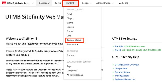
- Click the Content navigation menu item and then select Content blocks
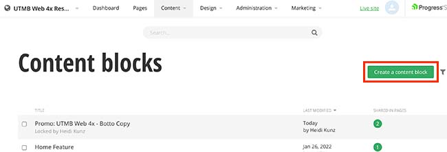
- Click the Create a content block button
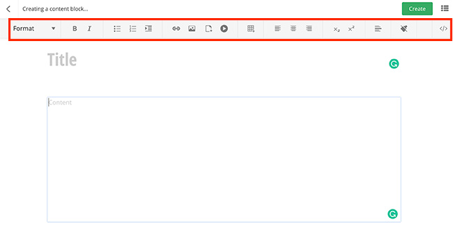
- Add a title. The title will not display on the page.
- Click in the content area to add content. Format content using the formatting toolbar and/or edit the HTML by selecting the </> option on the far right of the toolbar. Formatting options include:
- Make the text a paragraph, quotation, heading, bold, or italic
- Change the text color
- Create an unordered and ordered list
- Indent or outdent text
- Create a link
- Add an image
- Create a table
- Align content
- Make the text a subscript and a superscript
- Add a horizontal rule
- Remove formatting
- Optional: Add Categories and tags to filter what is displayed on a page. You can add multiple categories and tags.
- Click the Create button when finished
- Click the Content navigation menu item and then select Content blocks
Feature Box
See the various layout templates for the Feature Box widget component.
Create a Feature Collection
-
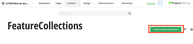
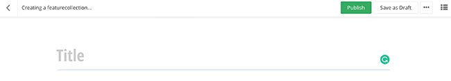
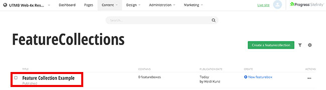
Create a Feature Collection
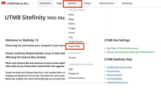
- Click the Content navigation menu item and then select Feature Box
- Click the Create a featurecollection button
- Add a title.
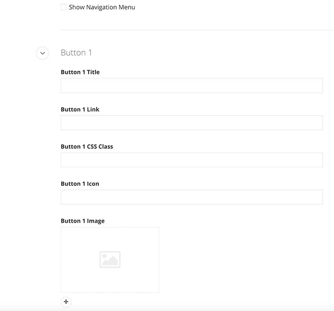
- Optional: Add buttons (maximum of 5 buttons)
- Check the Show Navigation Menu checkbox
- Enter in the button fields needed per button:
- Button Title
- Button Link
- Button CSS Class
- Button Icon
- Button Image
- Click the Publish button when complete.
- Click the Content navigation menu item and then select Feature Box
-
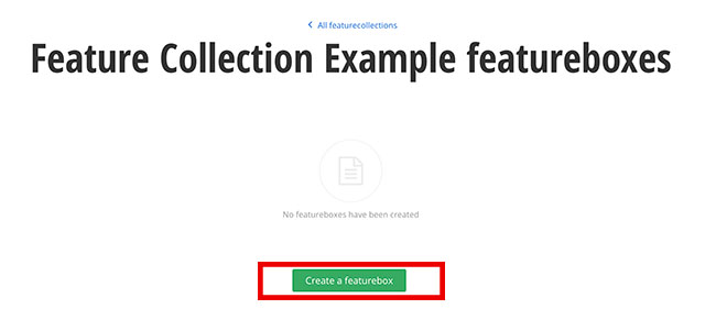
Create a Feature box
After you have created a Feature Collection, you can create Feature boxes. Each feature collection can have multiple feature boxes.
- Click the Feature Collection title.
- Click the Create a featurebox button
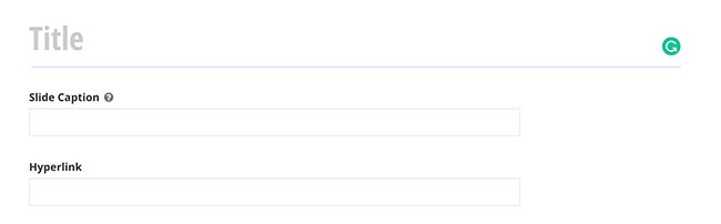
- Add a title, slide caption (optional), and a hyperlink (optional)
- Optional: Add Categories and tags to filter what is displayed on a page. You can add multiple categories and tags.
- Add an image. All images in a Feature collection must be cropped to the same dimensions.
- Click the Publish button when complete.
- Click the Feature Collection title.
Documents
Creating links to documents for the web from SharePoint
-
Sharing a SharePoint link on the web
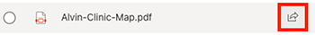
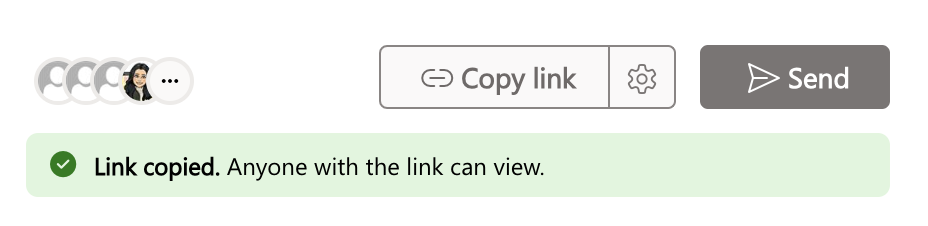
- In SharePoint, hover over the file that you want to share and click the share button.
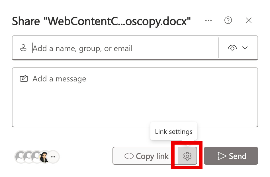
- Click the gear icon next to the Copy link button
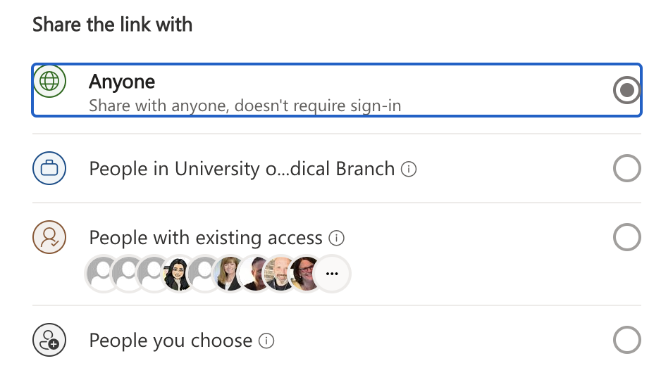
- Select who you would like this link to work for:
- Anyone: This link will be a public link and anyone who clicks the link can view the document
- People in the University of Texas Medical Branch with the link: Only UTMB employees who are logged into sp.utmb.edu can view the document
- People with existing access: Only people with existing access to the SharePoint folder can view the document
- Specific people: Only people you specify can view the document
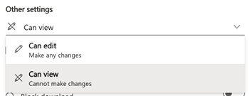
- Under Other settings, adjust the edit settings if necessary:
- Can edit: do not select this if you are making the link public as it will allow anyone with the link to edit the original document
- Can view: default setting which allows users to view and not edit the document
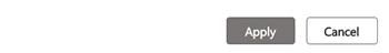
- Click the Apply button
- Click the Copy link button.
- You can now paste the link into a list item, content block, blog post, event, news item, etc.
Note: For documents to be shared with the public or anyone outside of your department, the document must live in the Collaboration environment in SharePoint.
- In SharePoint, hover over the file that you want to share and click the share button.
-
Replacing a SharePoint document without breaking links
- Name the new file the exact same as the file you would like to replace in Sharepoint.
- NOTE: It is best practice to not include dates in the file name of the document. You can rename the file in Sharepoint and it will not break the current link.
- Upload the new file into the same folder in Sharepoint where the current document is stored
- A window will pop up with the message: A file with this name already exists. Would you like to add this new file as the latest version of the existing files, or rename it and keep them both?
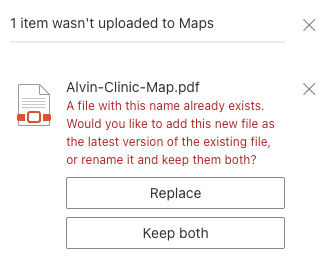
- Click the Replace button
- Name the new file the exact same as the file you would like to replace in Sharepoint.