Lorem ipsum dolor sit amet, consectetur adipiscing elit. Vestibulum et velit sed tellus fringilla hendrerit. Nullam hendrerit urna id justo tempor, eu sodales dui sodales. Vivamus vel cursus est. Fusce quis metus convallis elit tincidunt rhoncus suscipit vel mi.
Blogs: Blog Posts
Before getting started learn the basics:
How to create & edit blogs How to add blog posts to a page See all available template options
Layout Views
The widget component template
Learn how to do it:
-
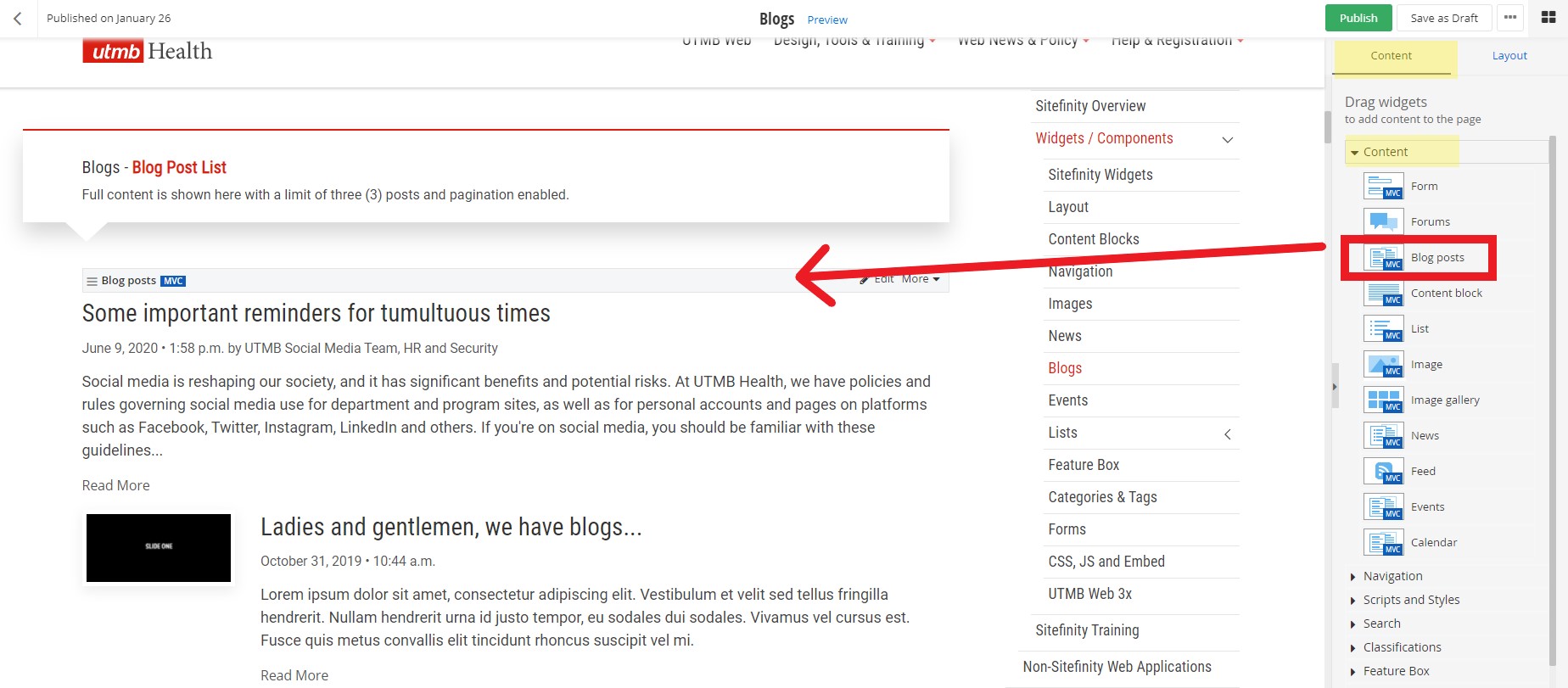
Add Blog widget to a page
Within the edit view of a page, you can add the blog post widget and display blog posts.
- On the right side menu, click the Content tab, click the Content drop down menu and find the Blog posts widget. Click, hold and drag the Blog post widget onto the desired part of the
page, and then release the blog post widget.
- On the right side menu, click the Content tab, click the Content drop down menu and find the Blog posts widget. Click, hold and drag the Blog post widget onto the desired part of the
page, and then release the blog post widget.
-
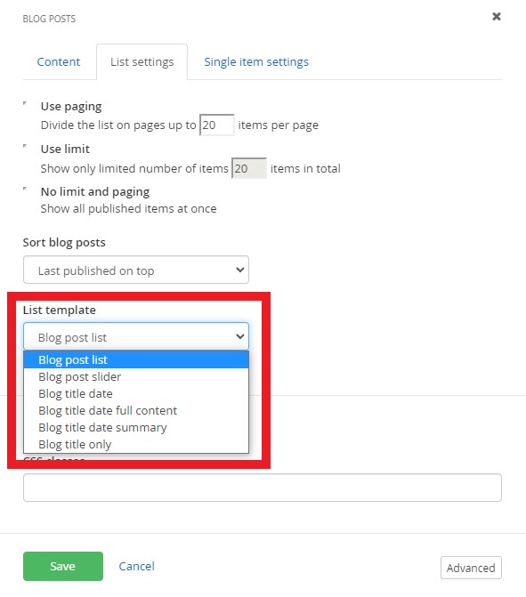
Select the blog post list template (layout)
Within the edit view of a page, you can customize how blog posts display.
- After you have added the blog post widget to a page, click the Edit button on the widget
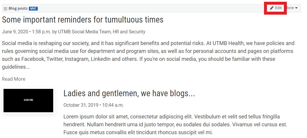
- Under the List settings tab, select the list template. Learn more about the available templates.
- After you have added the blog post widget to a page, click the Edit button on the widget
Blog posts list
-
-

And the Sitefinity blog posts continue
ivamus vel cursus est. Fusce quis metus convallis elit tincidunt rhoncus suscipit vel mi.
Blog title date
Blog title date full content
-

Ladies and gentlemen, we have blogs...
Lorem ipsum dolor sit amet, consectetur adipiscing elit. Vestibulum et velit sed tellus fringilla hendrerit. Nullam hendrerit urna id justo tempor, eu sodales dui sodales. Vivamus vel cursus est. Fusce quis metus convallis elit tincidunt rhoncus suscipit vel mi. Praesent condimentum purus vel lorem elementum, vitae efficitur massa consectetur. Aliquam iaculis ornare metus quis gravida. Suspendisse urna risus, tempus nec tempor ac, molestie vel velit. Fusce tincidunt purus quis felis eleifend rhoncus. Ut a scelerisque lacus. Nunc condimentum aliquam mattis. Nullam lacinia, enim quis pulvinar molestie, felis nisl tempor elit, ac dapibus mauris ipsum non ligula. Fusce scelerisque nisi quis purus volutpat, sodales tristique risus consectetur.
Maecenas vel hendrerit tortor. Donec metus ligula, fermentum vel porta a, suscipit at lorem. Class aptent taciti sociosqu ad litora torquent per conubia nostra, per inceptos himenaeos. Duis ligula felis, pellentesque id auctor a, vulputate id lectus. Cras vitae lacus et orci malesuada tempor. Vivamus quis faucibus neque. Donec felis elit, pharetra in massa id, maximus congue erat. Sed feugiat magna et dolor pretium rutrum nec nec turpis. Pellentesque eget felis pharetra leo pulvinar pharetra. Nunc a lacus vehicula justo facilisis rhoncus. Suspendisse ut ligula efficitur, consectetur metus a, efficitur dui.
Nunc condimentum molestie sem id commodo. Lorem ipsum dolor sit amet, consectetur adipiscing elit. Donec imperdiet ac ipsum sit amet congue. Morbi justo tortor, tristique volutpat egestas ut, accumsan vitae tellus. Proin ut turpis massa. Nullam nec mattis arcu, non tempus ipsum. Cras sit amet scelerisque lacus, nec lobortis libero. Phasellus porta posuere sapien, vel porttitor nisl molestie quis. Phasellus luctus tempus metus sit amet maximus. Donec quam nunc, aliquam eget felis eget, dignissim varius felis. Ut ornare pharetra tincidunt. Ut sed dictum augue.
Aliquam vehicula ultricies diam sit amet porta. Phasellus ullamcorper ex ac arcu pretium bibendum. Sed id interdum mauris, vitae maximus nisi. Pellentesque ornare sapien in venenatis semper. Morbi finibus, elit et mattis egestas, mauris nibh lacinia odio, at viverra lacus risus sit amet ex. Nunc lorem dui, scelerisque vitae luctus non, tristique nec sapien. Integer auctor arcu velit. Proin lobortis leo eget ipsum ullamcorper tincidunt et eget quam. Nunc sed fringilla dui. Maecenas egestas luctus leo nec cursus. Cras in pellentesque magna, ut bibendum ipsum. In purus sapien, imperdiet a malesuada at, ullamcorper sit amet turpis. Aenean egestas urna non libero porttitor, non varius nulla ullamcorper. Cras vulputate laoreet quam, ut mattis lacus dapibus nec.
Suspendisse elementum enim ut laoreet volutpat. Suspendisse potenti. Orci varius natoque penatibus et magnis dis parturient montes, nascetur ridiculous mus. Vivamus quis viverra orci. Fusce hendrerit mauris ante, sit amet imperdiet est volutpat nec. Curabitur vel quam a nibh venenatis pretium in ut orci. Aliquam erat volutpat. Proin et tortor sollicitudin, venenatis purus quis, cursus nisl. Sed laoreet laoreet lectus. Nunc scelerisque neque sit amet felis tempus scelerisque.
Blog title date summary
-
Ladies and gentlemen, we have blogs...
Lorem ipsum dolor sit amet, consectetur adipiscing elit. Vestibulum et velit sed tellus fringilla hendrerit. Nullam hendrerit urna id justo tempor, eu sodales dui sodales. Vivamus vel cursus est. Fusce quis metus convallis elit tincidunt rhoncus suscipit vel mi.
Blog title only
Customizations
Customize with CSS Classes.
Learn how to do it:
-
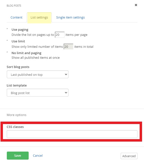
Add CSS classes to a blog widget
Within the edit view of a page, you can customize the style of the blog posts with pre-written CSS classes.
- After you have added the blog post widget to a page, click the Edit button on the widget
- Under the List settings tab, add CSS classes in the More options section.
- Insert CSS classes in the CSS classes field. Multiple CSS classes can be added but must be separated by a space. View pre-written classes for each available template.
- Insert CSS classes in the CSS classes field. Multiple CSS classes can be added but must be separated by a space. View pre-written classes for each available template.
- After you have added the blog post widget to a page, click the Edit button on the widget
Columns
2 Columns: list-col-md-6
2 Columns + Masonry: list-col-md-6 + list-masonry


Title Styles
Small: item-title-small
Medium: item-title-medium
Large: item-title-large
Make Heading Tag: title-tag-h5
The h5 in the class name can be switch out to h2, h3, h4, h6 and so on. Adding the class title-tag-h5 to an element will semantically change its title to a level 5 heading, which is typically used to represent a subsection under a heading of a higher level. This helps structure the content hierarchically, improving accessibility and SEO. It signals the intent to present the text as a heading of level 5, aiding screen readers and search engines in interpreting the content's meaning and importance. Learn more about headings.
Center Text: text-center
Hide Meta: meta-hide
Content Dividers
Divider: list-divider
Image Options
Float Image Right: img-right
Image Top: img-top
Hide Image: img-hide
Icon Options
Float Icon Left: icon-show icon-left
Show Icon: icon-show
Display Categories/Tags on items
Content items should have categories/tags applied to them before they will be displayed.
Display Categories: cats-show
Categories will display below the posted date and time and above the summary. In the example below the categories Sitefinity, Tools, and UTMB Web are displayed.
-
Ladies and gentlemen, we have blogs...
Lorem ipsum dolor sit amet, consectetur adipiscing elit. Vestibulum et velit sed tellus fringilla hendrerit. Nullam hendrerit urna id justo tempor, eu sodales dui sodales. Vivamus vel cursus est. Fusce quis metus convallis elit tincidunt rhoncus suscipit vel mi.
Display Categories on Top: cats-show cats-top
Categories will display above the title. In the example below the categories Sitefinity, Tools, and UTMB Web are displayed.
-
Ladies and gentlemen, we have blogs...
Lorem ipsum dolor sit amet, consectetur adipiscing elit. Vestibulum et velit sed tellus fringilla hendrerit. Nullam hendrerit urna id justo tempor, eu sodales dui sodales. Vivamus vel cursus est. Fusce quis metus convallis elit tincidunt rhoncus suscipit vel mi.
Display Categories on Bottom: cats-show cats-bottom
Categories will display below the summary. In the example below the categories Sitefinity, Tools, and UTMB Web are displayed.
-
Ladies and gentlemen, we have blogs...
Lorem ipsum dolor sit amet, consectetur adipiscing elit. Vestibulum et velit sed tellus fringilla hendrerit. Nullam hendrerit urna id justo tempor, eu sodales dui sodales. Vivamus vel cursus est. Fusce quis metus convallis elit tincidunt rhoncus suscipit vel mi.
Display Tags: tags-show
Tags will display below the summary. In the example below the tag Sitefinity is displayed.
-
Ladies and gentlemen, we have blogs...
Lorem ipsum dolor sit amet, consectetur adipiscing elit. Vestibulum et velit sed tellus fringilla hendrerit. Nullam hendrerit urna id justo tempor, eu sodales dui sodales. Vivamus vel cursus est. Fusce quis metus convallis elit tincidunt rhoncus suscipit vel mi.
Training
Create and Edit Blogs
-
Create a Blog
Create a Blog
- Click the Content navigation menu item and then select Blogs
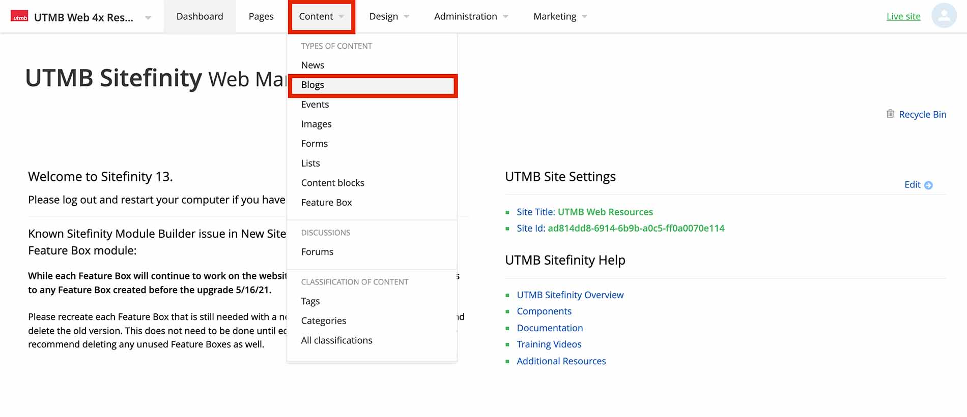
- Click the Create a Blog button
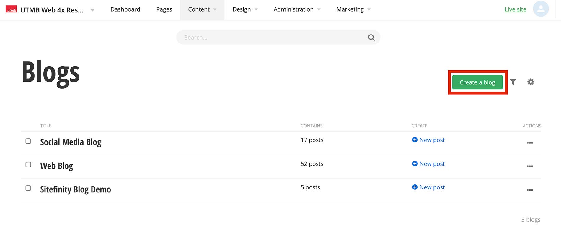
- Type the blog title and click the Create button
- Click the Content navigation menu item and then select Blogs
-
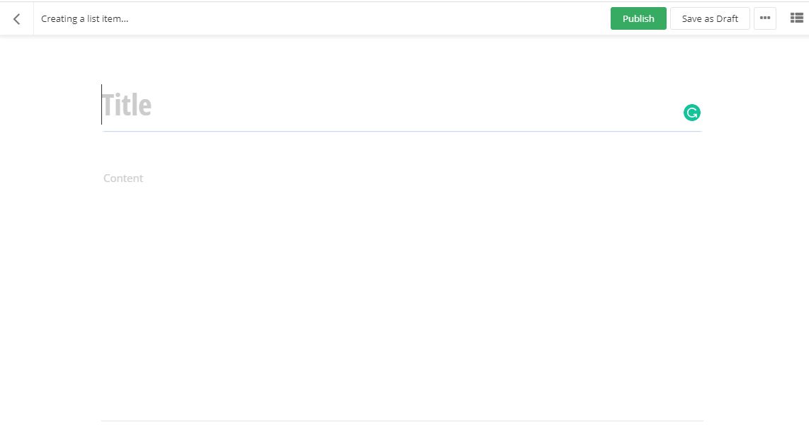
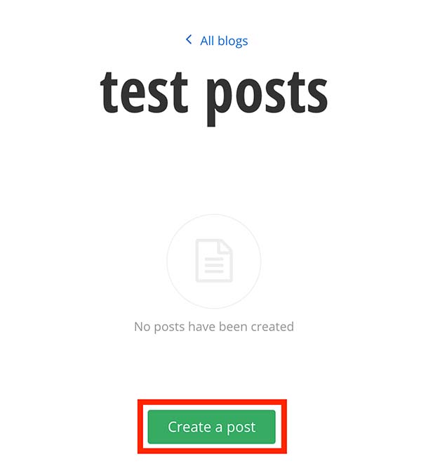
Create a Blog post
After you have created a Blog, you can now create blog posts.
Create blog posts
- Within the selected blog, Click the Create a post button
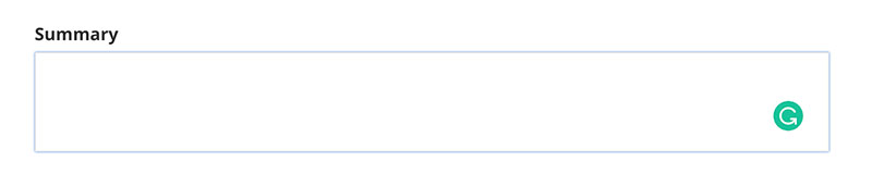
- Add a title. This will be displayed as your blog post title
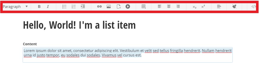
- Click in the content area. You have the option to use the formatting toolbar and/or edit the HTML by selecting the </> option on the far right of the toolbar. Type and format the content.
- Add a summary
- Add a featured image
- Under the Related Media section click the plus symbol
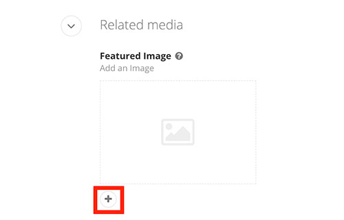
- Click Upload an image from your computer or Select an image from your library
- Click the Publish button
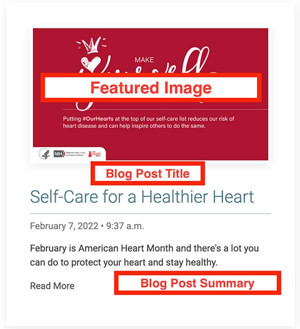
Blog post example showing featured image, blog post title, and summary:
-
Add Categories and Tags
Adding categories/tags allows the user to click on a desired category/tag to filter the content on the page. It can also filter specific items to be displayed on a page. You can add multiple categories and tags to content items such as lists, blogs, events, and images.

Adding Categories
- Click the plus symbol under the Categories section.
- Begin typing a category name to choose a predefined category, select create a category* (see note below), or select show all categories to select from the category list
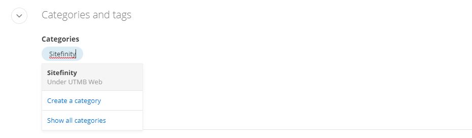
*NOTE: Any new category created should be saved under the site's parent category. Email sitefinity@utmb.edu for assistance in organizing new categories.
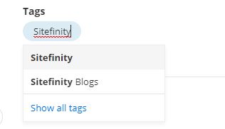
Adding Tags
- Click the plus symbol under the Tags section.
- Begin typing a tag name to create a new tag or select a predefined tag. You can also select Show all tags to search through the predefined tags.
-
Crediting author(s) and citing source
- Within the edit view of a blog post, under the Custom fields section, type in the author and/or article source information.
- Author: Set the author's name. e.g. - John Doe
- Article Source Name: Name of the external source where the original article was published
- Article Source Publish Date: Date the external article was originally published
- Article Source URL: add the website URL
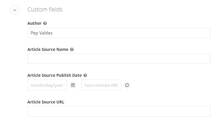
- Within the edit view of a blog post, under the Custom fields section, type in the author and/or article source information.
-
Redirect post to another webpage
Within the edit view of a blog or news post, you can redirect a post to another webpage. Note that any content in the content area will not display on a webpage.
- Under the Custom fields section, paste the URL in the Redirect URL field
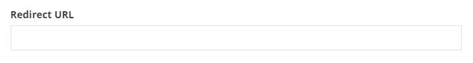
- Under the Custom fields section, paste the URL in the Redirect URL field
-
Create a Blog slider
Within the edit view of a blog post, you can add blog slider content that can be displayed on a page.
- Add a blog slider image
- Under the Related Media section click the Blog Slide Background Image plus symbol
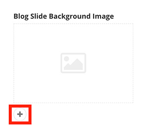
- Click Upload an image from your computer or Select an image from your library
- Under the Related Media section click the Blog Slide Background Image plus symbol
- Add the Blog Slide Title and Blog Slide Summary.
- Under the Custom Fields section add the title and summary if applicable. Keep both short.
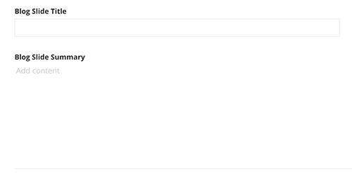
- Under the Custom Fields section add the title and summary if applicable. Keep both short.
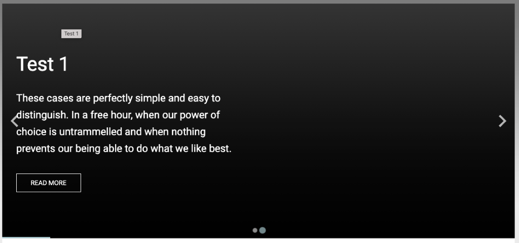
Blog slide example displayed on a webpage with default settings: If no content has been added to the Blog Slider fields in the edit view of a blog post, the slider will use the blog post Title and Summary fields, have a dark gray background, the text will be white with no card background behind the text and the button will be a transparent "read more".
- Add a blog slider image
-
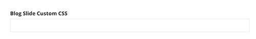
Customize Blog slider with CSS
Within the edit view of a blog post, CSS classes can be applied to affect the look of the individual slide, image, or content of a blog post.
Under the Custom fields section add classes to the Blog Slide Custom CSS field. Multiple CSS classes can be added but must be separated by a space. CSS classes can be found below.
Blog slide CSS classes
Classes with "sm" text will only affect small screens (smaller than 640px).
Classes with "md" text will only affect medium screens (641px to 1007px).
Classes with "lg" text will only affect large screens (1008px and larger).Card overlay color
- uk-overlay-default (White transparent background)
- uk-overlay-primary (Dark transparent background)
Card overlay placement
- uk-position-top
- uk-position-left
- uk-position-right
- uk-position-bottom
- uk-position-center
- uk-position-top-left
- uk-position-top-center
Slide Background Image Handling
- img-fill
- img-sm-fill
- img-md-fill
- img-lg-fill
- img-contain
- img-sm-contain
- img-md-contain
Content title text size, style and heading structure
- title-h1 (default)
- title-sm-h1
- title-md-h1
- title-lg-h1
- title-h2
- title-sm-h2
- title-md-h2
- title-lg-h2
- title-h3
- title-sm-h3
- title-md-h3
- title-lg-h3
- title-h4
Content summary text size
- summary-large
- summary-sm-large
- summary-md-large
- summary-lg-large
- summary-medium (default)
- summary-sm-medium
- summary-md-medium
Content text alignment
- text-left (default)
- text-right
- text-center
Content text color options
- content-red
- content-gray
- content-gray-light
- content-white (default)
- content-black
- content-blue
- content-blue-light
- content-teal
- content-teal-light
- content-orange
- content-orange-light
- content-green
- content-green-light
- content-gray-1
Card Overlay width (%-based)
- content-width-30
- content-width-sm-30
- content-width-md-30
- content-width-lg-30
- content-width-40
- content-width-sm-40
- content-width-md-40
- content-width-lg-40
- content-width-50 (default)
- content-width-sm-50
- content-width-md-50
- content-width-lg-50
- content-width-60
- content-width-sm-60
- content-width-md-60
- content-width-lg-60
Button text options
- btn-read-more (default)
- btn-read-article
- btn-learn-more
Button color and size options
- btn-default (default)
- btn-red
- btn-gray
- btn-gray-light
- btn-white
- btn-black
- btn-blue
- btn-orange
- btn-green
- btn-purple
- btn-teal
Background color + gradients
- red-bg
- gray-bg (default)
- gray-light-bg
- gray-mid-bg
- gray-dark-bg
- blue-bg
- blue-light-bg
- teal-bg
- teal-light-bg
- orange-bg
- orange-light-bg
- black-bg
- white-bg
- gray-1-bg
- gray-2-bg
- gray-3-bg
- gray-4-bg
-
Scheduling to publish and/or unpublish
Within the edit view of a page or content item, you can schedule a post to publish and/or unpublish on a specific date.
- Click the ellipses button (...) on the top-right of the page. Then select Schedule publish/unpublish from the drop-down menu.
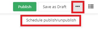
- Type or select the date and time you would like to publish the page or item. You can also type or select the date and time you would like to unpublish. Click the Save changes button
when complete.
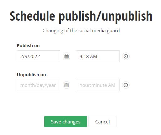
- Click the ellipses button (...) on the top-right of the page. Then select Schedule publish/unpublish from the drop-down menu.
Add Blog Posts to a Page
-
Add Blog widget to a page
Within the edit view of a page, you can add the blog post widget and display blog posts.
- On the right side menu, click the Content tab, click the Content drop down menu and find the Blog posts widget. Click, hold and drag the Blog post widget onto the desired part of the
page, and then release the blog post widget.
- On the right side menu, click the Content tab, click the Content drop down menu and find the Blog posts widget. Click, hold and drag the Blog post widget onto the desired part of the
page, and then release the blog post widget.
-
Selecting which Blogs to display
Within the edit view of a page, you can select which blog post(s) to display.
- After you have added the blog post widget to a page, click the Edit button on the widget
- Under the Content tab, select which blog posts to display
- From all blogs: This is the default setting. This will display all blog posts from all blogs on the website.
- From selected blogs only: you can specify which blogs to display
- From currently open blog: do not use this setting
- Selected blog posts: you can select one or more individual blog posts to display
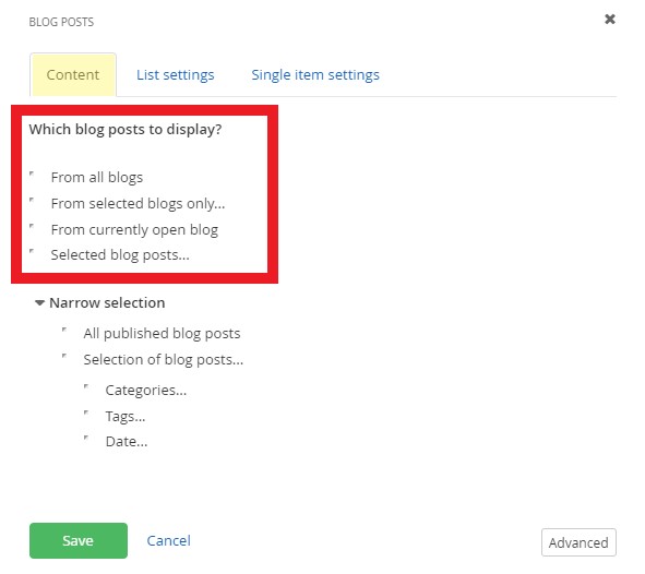
- Narrow selection further
- All published blog posts: This is the default setting. This will display all published blog posts.
- Selection of blog posts: you can add filters for categories, tags, and/or published dates. You must add categories and/or tags to the blog posts before you can add the filter to the blog post widget.
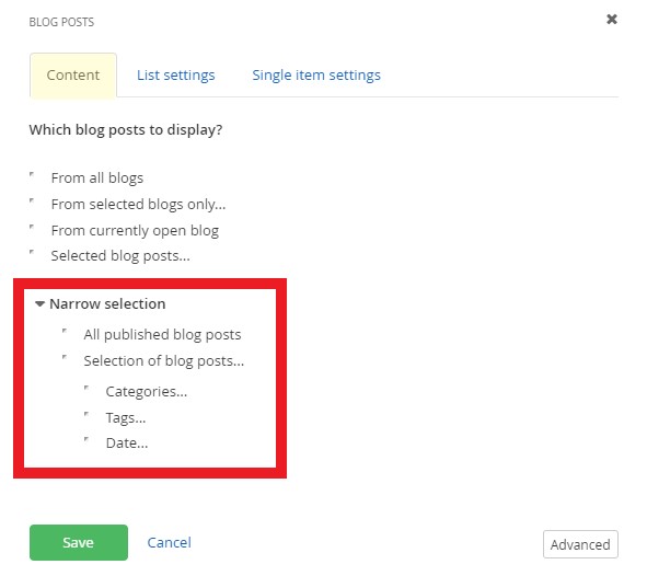
- Click the Save button when finished.
- After you have added the blog post widget to a page, click the Edit button on the widget
-
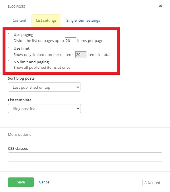
Set the blog post paging & limit the number of items to display
Within the edit view of a page, you can customize how blog posts display.
- After you have added the blog post widget to a page, click the Edit button on the widget
- Under the List settings tab, select the paging and limit settings.
- Use paging: This is the default setting with up to 20 items per page displaying. You can edit the number of items displayed.
- Use Limit: You can limit the number of items displayed.
- No limit and paging: Shows all published items at once. This setting is not recommended.
- After you have added the blog post widget to a page, click the Edit button on the widget
-
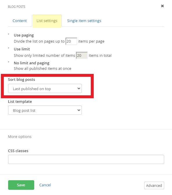
Sort blog posts on a page
Within the edit view of a page, you can sort blog posts with these settings:
- After you have added the blog post widget to a page, click the Edit button on the widget
- Under the List settings tab, select limit settings:
- Last published on top: This is the default setting. Sorts the latest articles that have been published in descending order by date.
- Last modified on top: Sorts the latest articles that have been edited and saved in descending order by date.
- By Title (A-Z): Sorts by the title field of the blog post.
- By Title (Z-A): Sorts by the title field of the blog post.
- As set manually: Sorts by the the order of the blog posts in the blog. You can manually reorder blog posts.
- As set in advanced mode: Do not use this setting
- After you have added the blog post widget to a page, click the Edit button on the widget
-
Select the blog post list template (layout)
Within the edit view of a page, you can customize how blog posts display.
- After you have added the blog post widget to a page, click the Edit button on the widget
- Under the List settings tab, select the list template. Learn more about the available templates.
- After you have added the blog post widget to a page, click the Edit button on the widget
-
Add CSS classes to a blog widget
Within the edit view of a page, you can customize the style of the blog posts with pre-written CSS classes.
- After you have added the blog post widget to a page, click the Edit button on the widget
- Under the List settings tab, add CSS classes in the More options section.
- Insert CSS classes in the CSS classes field. Multiple CSS classes can be added but must be separated by a space. View pre-written classes for each available template.
- Insert CSS classes in the CSS classes field. Multiple CSS classes can be added but must be separated by a space. View pre-written classes for each available template.
- After you have added the blog post widget to a page, click the Edit button on the widget
-
Customize how the blog post article displays
Within the edit view of a page, you can customize how blog post articles display and select the page that it opens in. You must create a separate page with the blog post widget on it first.
- After you have added the blog post widget to a page, click the Edit button on the widget
- Under the Single item settings tab, select the page that the full article opens in.
- Auto-generated page: This is the default setting and will open the article within the same page. This setting is not recommended.
- Selected existing page: Select the article page with the blog post widget on it.
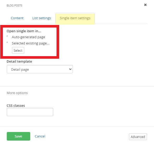
- You can also add custom CSS classes to the article under the More options section. View the blog posts classes and examples.
- After you have added the blog post widget to a page, click the Edit button on the widget