Our Story
UTMB’s refreshed brand honors more than 130 years of progress, rooted in discovery, education, and care that have shaped countless lives since the first students entered Old Red in 1891.
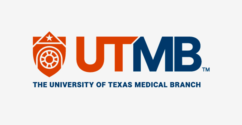
Guided by mission and united in vision, everyone at UTMB carries forward a legacy of excellence with quiet determination and extraordinary impact. The new brand and shield design reflect our enduring strength, trust, and belonging while connecting us to The University of Texas System.
“Where Purpose Meets Passion” expresses our promise: to advance health, knowledge, and compassion in every action we take, today and for generations to come.
Why a Brand Refresh?
Why a Brand Refresh?
- Strengthen recognition and consistency across every part of the institution — from patient care to education, research, and innovation.
- Modernize UTMB’s visual identity to reflect who we are today: a growing, forward-thinking academic health system and medical school.
- Unify the brand experience for patients, students, employees, and partners so our communications feel cohesive, clear, and trusted.
- Support strategic growth, including expansion of services, new facilities, and emerging programs across Texas and beyond.
- Improve usability and accessibility by updating digital and print assets to meet modern design and accessibility standards.
- Honor our legacy while looking ahead, ensuring UTMB’s brand reflects both our 130-year history and our commitment to the future of health.
